Project Brief
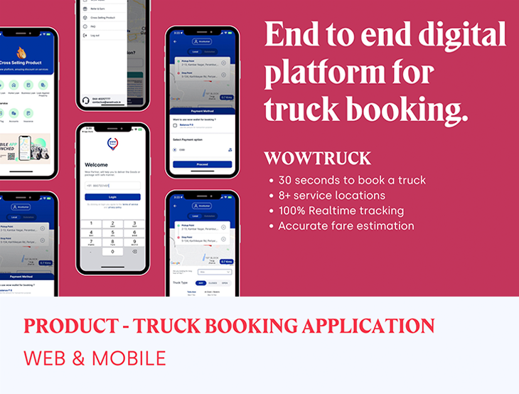
The Wowtruck Logistics App represents an innovative delivery solution aimed at addressing the common challenges faced by individuals and organizations when sending parcels. While the concept is not entirely new, this app effectively resolves certain issues encountered by similar logistics companies.Wowtruck is a startup based in Chennai that currently relies on a manual delivery process. However, the ultimate goal is to automate the system while placing a strong emphasis on improving the user experience and meeting business requirements. The primary objective of the application is to connect users with the nearest available dispatch riders in their vicinity. This feature shares similarities with the convenience associated with ride-hailing apps like Uber, which have gained widespread popularity over the years.
Timeline: ~6 months
Duties: Team's Design Lead, covering interaction design, product strategy, visual design, UX content In collaboration withproduct owner, technical architect, software developers, product analysts
Tools: Photoshop, Adobe XD, Invision, Axure, Illustrator.
Project scope
- Digital Transformation Strategy.
- Carry out a market demand and trend analysis.
- UX Research & Testing.
- Build — Wireframe, UI Screens and Prototype.
- Android & ios App Design.
Design Strategy
A Design Strategy demonstrates the value that your products and services will bring to people and describes this value as a goal state. It also outlines the broad steps you'll take to achieve this goal. Typically, these steps involve technology, and when they do, the focus of a design strategy is on minimizing the visibility of technology seams.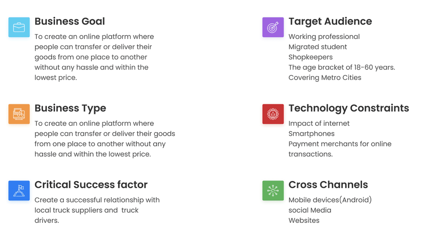
Problem
The customers who request the trucking service from wowtruck have to call them and book services. Allocation of trucks, payment, and tracking of trucks and had to be done manually and it leads to an inefficient and time-consuming operation. wowtruck company wanted to automate the entire process using a digital solution.Target Audience
The target audience for truck booking applications can vary depending on the specific features and services offered by the app. However, in general, the primary target audience for truck booking applications includes businesses, freight shippers, and individual consumers.User's Goals
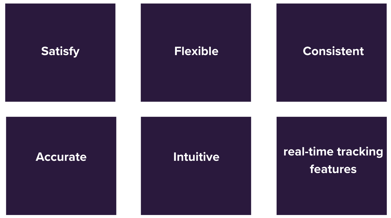
The customers who request the trucking service from wowtruck have to call them and book services. Allocation of trucks, payment, and tracking of trucks and had to be done manually and it leads to an inefficient and time-consuming operation. wowtruck company wanted to automate the entire process using a digital solution.- The aim is to solve an existing problem and satisfy users.
- Create a user-friendly UX flow suitable for all ages and user types.
- Designing user interface that will be consistent across all devices and systems.
- Creating a user flow that would be intuitive for the customers.
- Deliver amount should be accurate and transparent enough for easy understanding.
Research
Qualtitive research :I interviewed about 12 people (through calls, chats, and physical interviews) who were potential target users to understand their views and experiences using existing similar applications, as well as to identify their pain-points and gather improvement suggestions. The target audience consisted of regular individuals, shop/business owners, online vendors, and manual delivery logistics companies.
The results from the interviews were as follows:
- 5 business owners use the manual process but had some issues with delivery time and sometimes the logistic companies cancels a delivery due to unknown reasons. Therefore they have to wait an extra day or more before they get their parcels delivered.
- 4 regular day-to-day individuals seldomly use online delivery service to send out parcels but often get stuck knowing the accurate weight of their items which is always a required field to fill when making a request. Now the logistic company always have to send them a weight update with the price difference and this is time wasting.
- 3 random users often do not have a delivery dispatch rider that can come to pick up their item at that time which they need their parcels sent. They are always told to book a request a day or more before time so as to allocate a dispatch to their area to pick up the item.
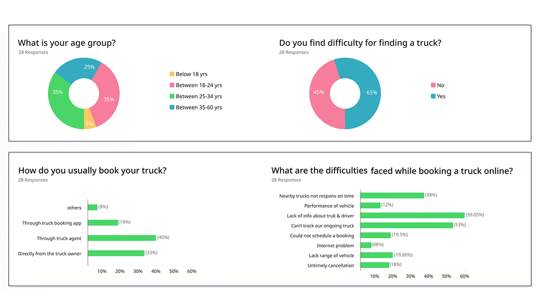
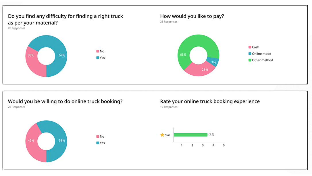
I have conducted an online survey and prepared a specific set of questions, as well as a few random questions tailored to individual users' willingness to respond. This was done to gain a better understanding of online truck booking preferences.
As a result, I have received 40 to 50 responses.
Key Challenges

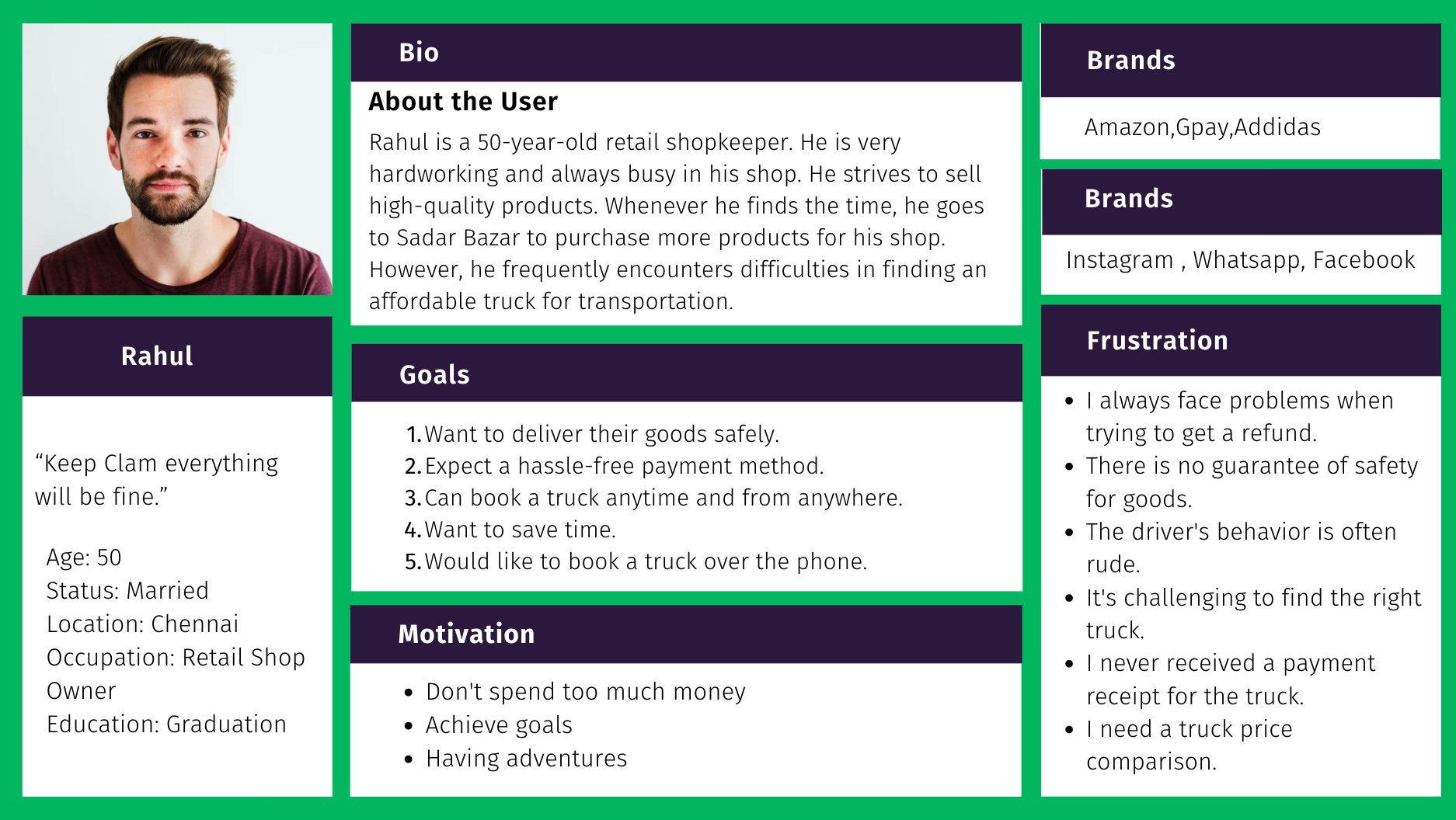
Personas
Creating user personas based on user interviews is a valuable practice for better understanding and empathizing with your target users.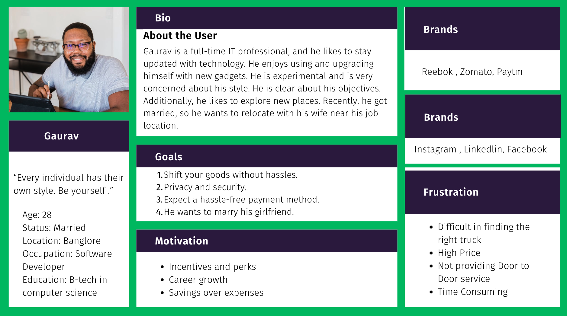
Empathy Mapping
Creating user personas based on user interviews is a valuable practice for better understanding and empathizing with your target users.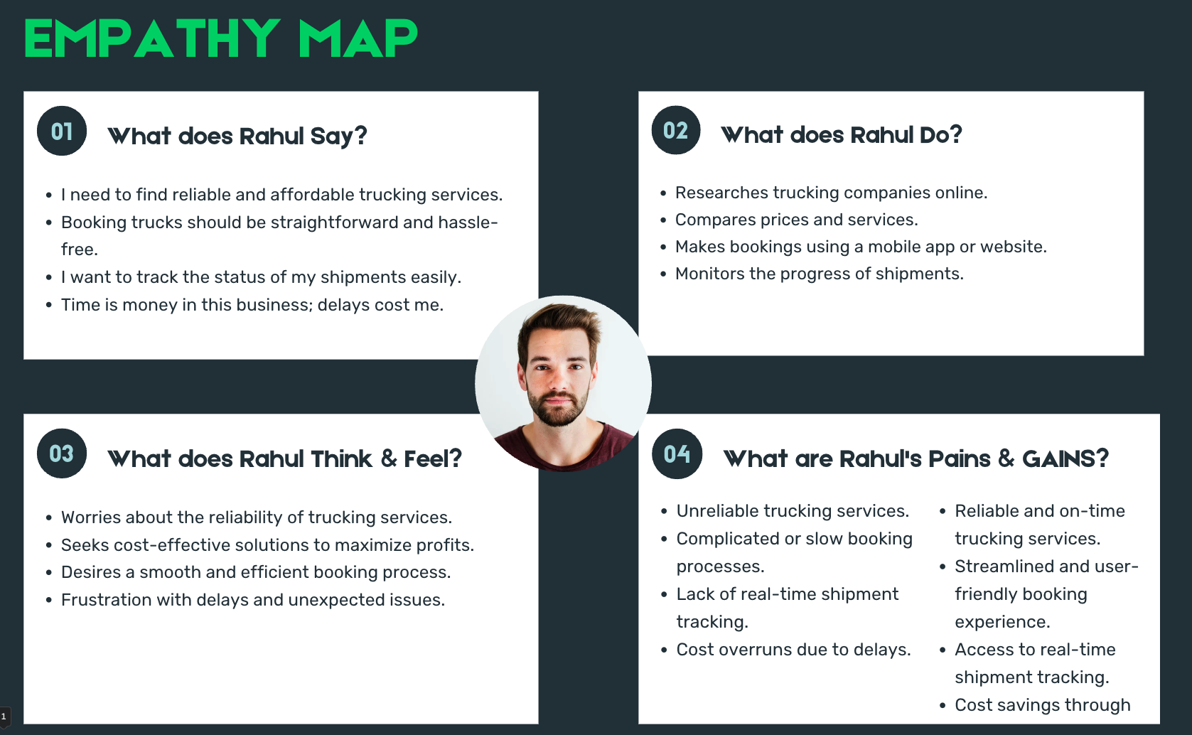
Scenario
A user scenario is the fiction story of a user's accomplishing an action or goal via a product. It focusses on a user's motivations and documents the process by which the user might use a design. User scenarios help designers to understand what motivates users when they interact with a design - a useful consideration for ideation and usability testing.Relocation of a House Without the Hassle by Lorrigo :
Gaurav had moved to bangalore for a job when he was still a bachelor, living with his friends. During this time, he had purchased various home appliances and furniture to meet their daily needs. Recently, Gaurav got married and needed to find a new place for himself and his wife. Fortunately, he found a beautiful 2BHK flat for them. However, the challenge was relocating all their belongings to the new house.
Gaurav began his search for a truck provider to assist with the move. He obtained estimates from various truck rental services but was left feeling confused as none of them seemed to offer the right fit for his needs. Additionally, he struggled to find a provider who could commit to arriving on time and offering door-to-door service.
That's when one of his friends, Karan, suggested he use the Lorrigo app to book a truck. Intrigued by the idea, Gaurav quickly installed the app and began exploring the available options. The app allowed him to enter the pickup and drop-off locations and even schedule the trip according to his preferred timing. What set Lorrigo apart was its commitment to providing door-to-door service.
Gaurav selected the most suitable truck for his requirements and specified the type of goods he needed to transport. Making the payment through Paytm was a breeze, and he was delighted to discover that his delivery arrived right on schedule. With everything smoothly transported to their new house, Gaurav and his wife found themselves happily settled in their new home, free from the hassles of relocation.
Story board
Storyboarding is a great way to demonstrate the user experience.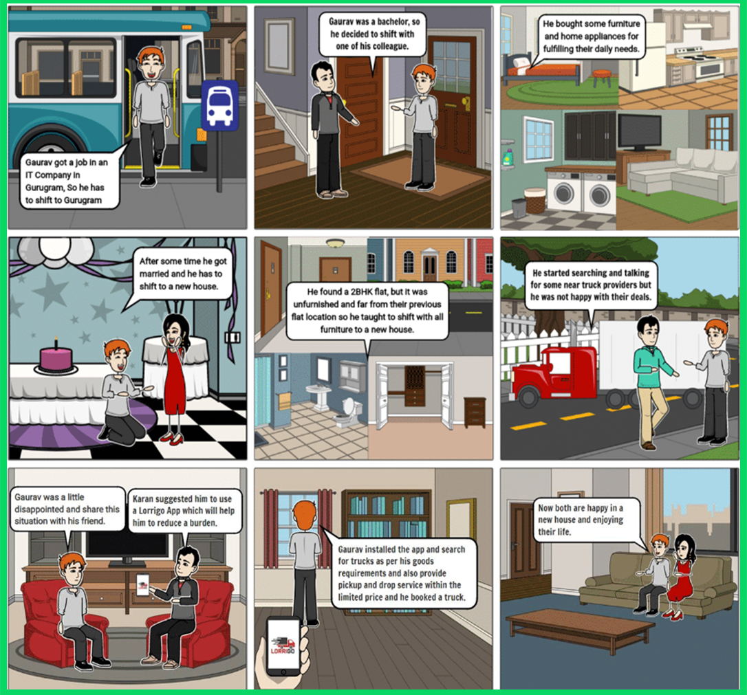
User flow
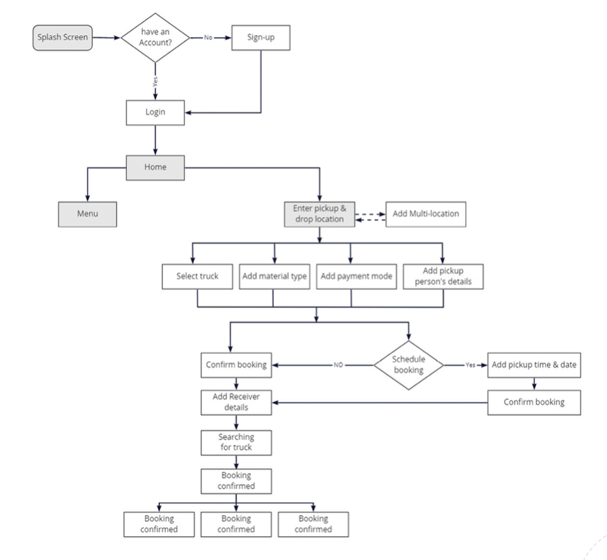
Information Architecture
Designing the information architecture for a truck booking application involves structuring and organizing the app's content and features in a logical and user-friendly manner.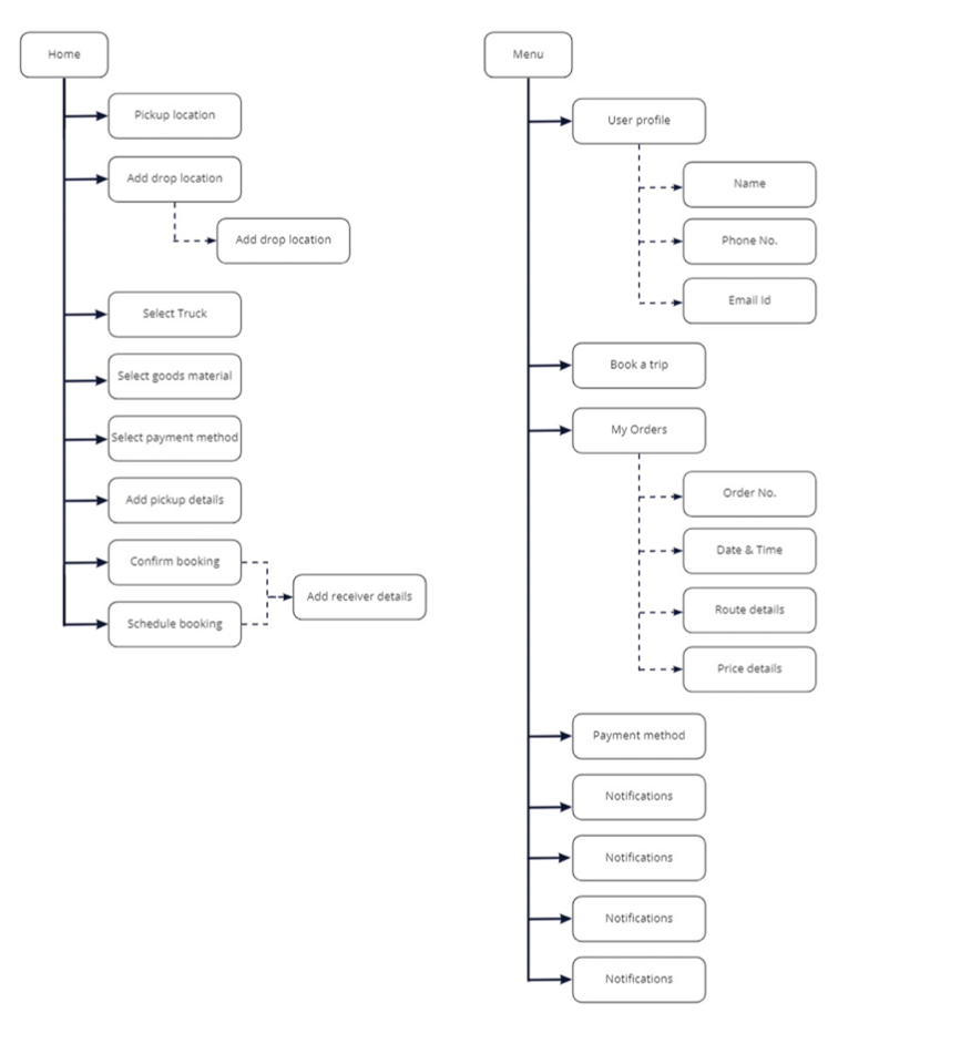

Two Native Apps
I planned to create two mobile apps, one for Customers and one for drivers. In between, I have added key interactions with the aim to delight users beyond the basic requirements of managing deliveries.Low-Fi Wireframes
Then we started wireframing the process which helped us in making things more tangible. For early testing, we converted our wireframes into clickable prototypes and gathered feedback from few users.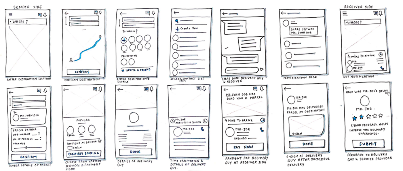
User Interface Design
I turned the wireframes from low-fidelity to high-fidelity screens. We also made a clickable prototype and gathered feedback from targeted users.We involved our users in every step. We iterated quickly, focusing purely on interactions and process flows.
Interface Design Tool: Adobe XD
Version Control: XD
Clickable Prototype: Invisionapp
Bringing It to life :
Our objective became what we’re trying to solve. Our personas became for whom we're solving the problem. Our design principles became how we are going to solve the problem for real people.
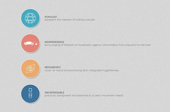
Design Principles :
Based on our user data, we constructed the following design principles to guide our work. If Logistics is truly to "come alive," then every design decision must be made in fidelity to the design principles.
Visual Design
Visual Languages :Our research lead us to pioneer a self-driving truck service. We knew that the visual representation of Fleet had to follow suit in its uniqueness.
Visual Competitive Analysis :
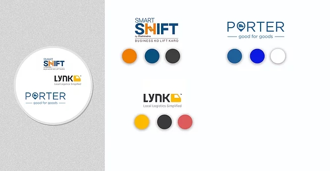
Our competitor’s visual brands neither aligned to our user research nor represented the sensation of actually driving. Porter touts itself as “making a difference” with its trademark blue and photos of the environment. Our research indicated that this is a moot point among Wowtruck’s target users. Lynk and Porter’s branding represents the lifestyle created by using the service—not by driving. This created a prime opportunity to create a visual language both fresh to our domain and grounded in research.
Improving Visual Hierarchy :
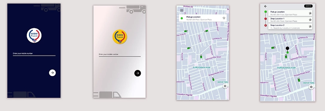
Iteration 1 limited choice, by pre-selecting the cheapest, closet vehicle for the user with equal weight given to the cancel and booking options. Iteration 2 wrongfully created more options and therefore created more steps with the poorly received "book for later" option. Iteration 3 cleaned up the interface and prioritized what users wanted to see: the truck. However, the CTAs aren't given affordance as clickable items. The final iteration improves upon the UX of #3 in that it displays more information for the self hiring truck, providing an "exit strategy." The UI is stronger in #4 than in the previous iteration because #4 uses sensible, purposeful placement of shapes to create affordance of action.
Crowded But Clean :
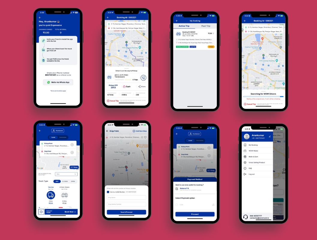
Our user research affirmed that users expect to see a map with the self hiring truck arriving. This visual cue helped bridge the gap between what users are accustomed to and what new technology wowtruck brings forth. Iterations 1-3 mistakenly took "minimalism" too far by removing information users felt important such as arrival time, license plate #, and payment meter. Iteration 3 lacked necessary information that users found essential such as fare and drop-off details. The final UI polish in screen 4, sought to display a lot of pertinent information while showing a more elegant look with rounded corners, more white space, and translucent overlays.
User Testing
Our team facilitated three rounds of testing with our paper and then our Invison prototypes over two weeks. We gave users a the task of booking a Truck, encouraged him/her to think aloud, and we recorded how the user interacted with the prototypes. Each round helped us find "ah-ha!" and "why didn't I think of that" moments along the the way. It doesn't really matter how good of an idea I think it is; if it fails with users, it needs to change.We found that users desire :
Clearer directions. Users expressed higher levels of confidence with using the Truck prototype when given regular and intermittent confirmations and directions.
Predictive destinations.
As a designer, I became obsessed with limiting the number of clicks a user had to complete. Users desired my low-fi prototype because it just felt “so simple.” Fewer options meant less clicks and a lighter cognitive load. Given that we needed to create “ease” into our product, this idea stuck with me. If wowtruck lives by the design principles Neighborly and Populist, then wowtruck ought to know and remember the behavior set of its user. wowtruck should store and predict where drivers might need to go. This lead to the creation of populating destinations and automating the keyboard pop up.
Multiple use cases :
Originally we designed wowtruck applications as a point-to-point truck service. A user enters in the destination, drives, and never looks away. This concept tested well.. until it didn’t. While reflecting on the prototypes after a concept test, a user unearthed a series of potential use cases to which we had been completely oblivious
Solutions
- Made the login process easier. Just enter your mobile no, verify through OTP. Done! Login via social/email
- Integrated google maps & made location selection easier.
- We noticed that ports were being used frequently in location but ports were not easily recognizable from google map address. So we made a separate port selection for easy access
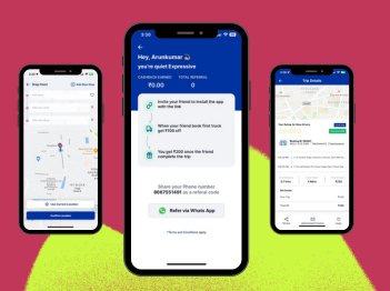
- Customers can save addresses & can see recently used addresses
- Multiple stop locations
- 3D truck images with proper details so that even a new user can easily select a truck
- Hire a truck in fixed-rate pricing
- Hire a truck for the Whole day
- Book Round Trip (Updown trips)
- The shipper can select additional services according to their needs (Labor, extra weight, etc.)
- Prioritize favorite driver
- Block Driver
- A new user interface
- Reduced the learnability curve
- bidding
Reviews
The reviews are good so far. There are still a lot of things to do.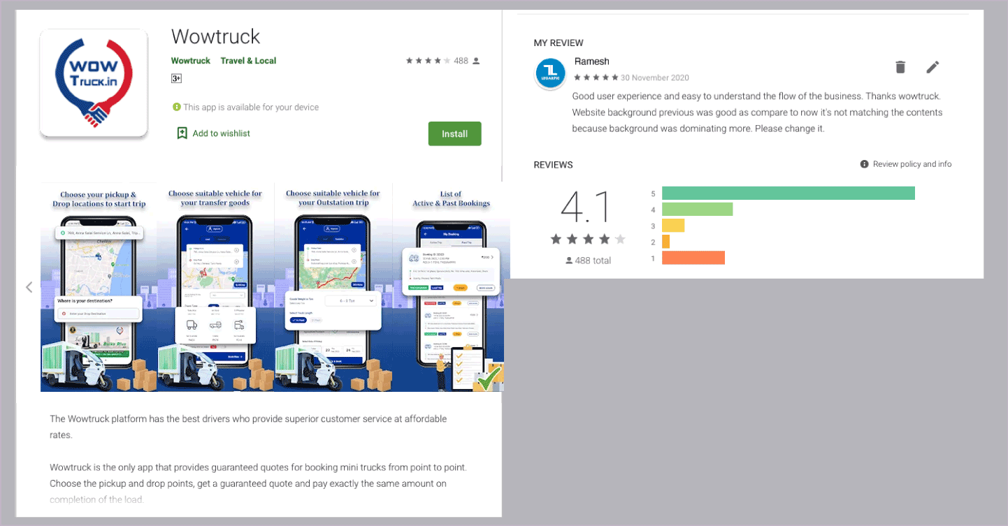
- 👨💻 Downloads: 50000+
- 🏆 Reviews: 500+
- 🌟 Rating: 4.1
Measure/Impact
Coming up with a solution isn't enough. We had to show its success with data/matrics. But as I mentioned earlier: To comply with my non-disclosure agreement, I have omitted and obfuscated confidential data/matrics in this case study. Here are some example metrics we used to measure the success of the redesign- Task completion rate — Percentage of the correctly completed task
- Task completion time — the time it takes for the user to complete a task
- Engagement — How often users are interacting
- Retention — Persuading the user to use again
- Revenue — Is the product making money?
Reflections
My Proud Moments:While this project only exists in the academic and conceptual space, we treated it as the 'real deal.' Our realistic lens didn't curb our creativity; it enhanced it. Our team was the only one in my cohort to take a leap beyond what was typical. We wanted to follow our research faithfully. So when a real case could be made for hiring a truck, we took advantage of that opportunity. We weren't afraid to venture into unknown territory. Our goal was to provide our prospective users with the best experience possible. Fleet turned out to be quite bold, both in appearance and concept.
Lessons Learned:
Divorcing yourself from being a user is crucial. Had I navigated through this design project assuming that my goals, motivations, and intuitions were the same as the target users', Wowtruck would have turned out to be a product undesirable to many. As a millennial who uses Lynk and Porter, I would have prioritized design decisions that ended up conflicting with our UX research and usability tests. Lesson learned. User data is king. Asking the right questions of the data can transform the usability of a product. During UX research, we acquired a massive amount of data. When we reached an impasse, we looked back at our user interviews and usability test reports to confirm hypotheses, refute assumptions, and chart our course. Behavioral data over attitudinal data. In our first concept test, what users said they wanted versus what they actually used was markedly different. Had we overcompensated based on what people said they desired, our product would have ultimately decreased in usability and desirability. For example, users said they liked having lots of vehicle options. Through a behavior-based survey, users consistently chose the closest and most affordable option. We, as designers, decided to address this discrepancy. Design patterns exist for a reason. Innovation is cool, but venturing into new waters must be done with light strokes. The purpose of this project wasn't to 'show off' creativity, but rather to design a solution in full consideration of constraints and reflective of user data. When we mistakenly tried to design 'outside-of-the-box' a bit too much, it caused user confusion during testing.
If I Were to Continue:
While we were proud of our final concepts, there's always more work to be done. If we were to continue working on the project, we would have added another round or two of user testing. Each time we completed a round of testing, we uncovered user insights that were previously unseen. The final polish of the UI took a few leaps from its previous iterations that went untested by users. I would have liked to confirm or refute UI decisions. We were set on creating an MVP of Wowtruck in consideration of our time constraints. Given more time, I would have liked to ideate and test more UX features, aiming to solve more experiential-based problems that users face when hiring a truck.

