Project Brief
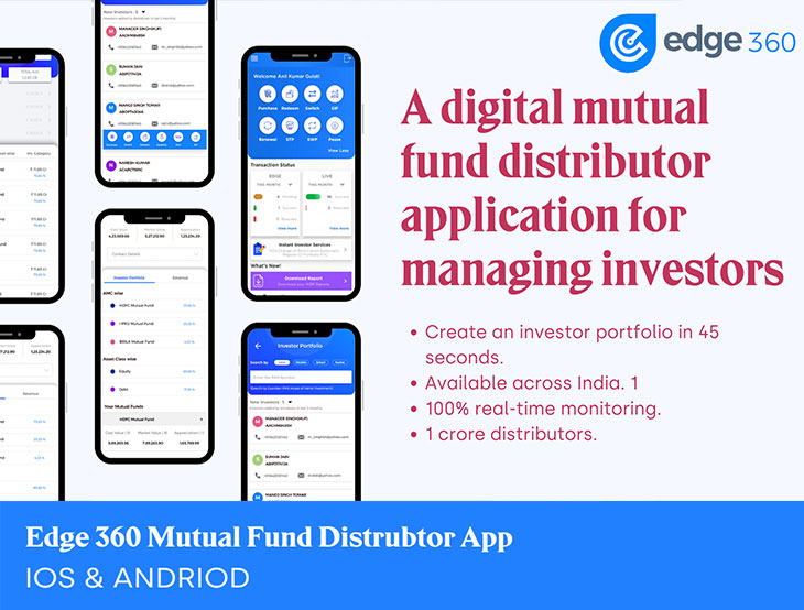
The Edge 360 Application is designed with a primary focus on providing Mutual Fund investors with a completely digital investing experience. Its goal is to deliver maximum benefits to both investors and distributors by exclusively offering direct plans in mutual fund schemes, free from any concealed commissions.The Edge 360 application serves as an investment adviser (IA), offering a range of services, including investment execution and advisory support. Its user-friendly interface simplifies the investment process by eliminating the need for paperwork, facilitating seamless digital Know Your Customer (KYC) procedures, automating payments, providing real-time portfolio updates, and offering powerful insights to assist users in making well-informed investment decisions.
Edge 360 is accessible across various platforms, including web, Android, and iOS. In this case study, we will delve into the design journey of the app and explore the innovative solutions developed by the Flolab team.
Timeline: ~6 months
Duties: Design Lead, covering interaction design, product strategy, visual design, UX content In collaboration withproduct owner, technical architect, software developers, product analysts
Tools: Photoshop, Adobe XD, Figma, Balasamiq, Illustrator
Deliverables: Mid-fidelity prototype, wireframes, hi-fidelty comps, presentation deck
Objective
The objective of this case study is to showcase the UX design process and the improvements made to a Mutual Fund Distributor app, with the aim of enhancing user experience, simplifying investment management, and increasing user engagement.Design Strategy
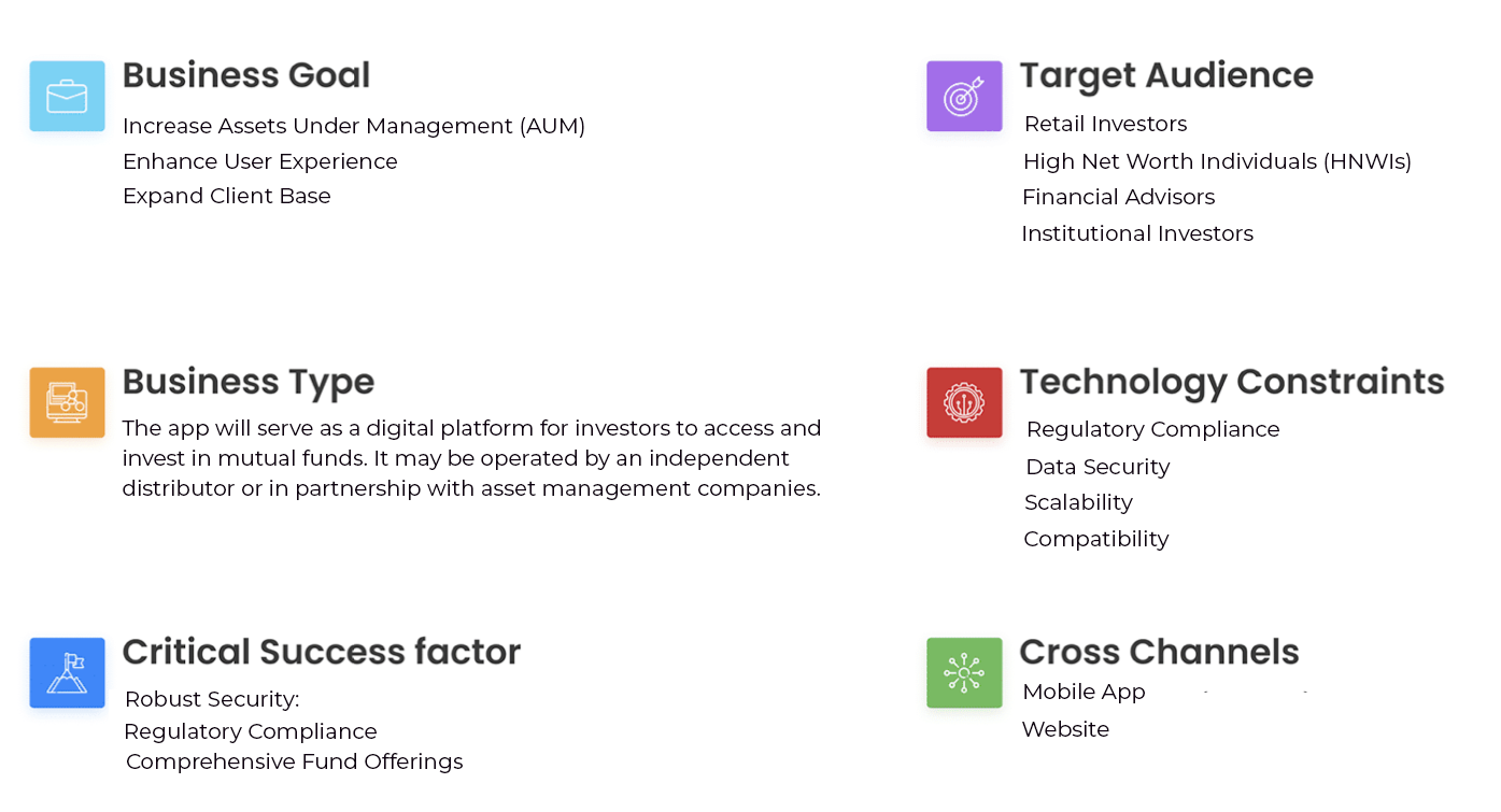
Designing a strategy for a mutual fund distributor app requires careful consideration of various elements, including business goals, business type, critical success factors, target audience, technology constraints, and cross channels.Here's a comprehensive strategy outline:
Challenge
The task at hand involves transforming the current Edge 360 application into a streamlined version tailored for the Cams App. The primary objective is to present the Know Your Customer (KYC), investment, portfolio, and payment sections with concise information, ensuring that users can effortlessly engage in mutual fund investments while also having access to comprehensive details prior to making their investment decisions.Problem
The existing Mutual Fund Distributors application suffers from an unintuitive and user-unfriendly interface, resulting in diminished user engagement and complications in effectively overseeing clients' mutual fund investments. Distributors encounter difficulties in retrieving crucial client data, evaluating various funds, and efficiently executing investment-related actions. Therefore, it is imperative to overhaul the application's user interface to enhance user satisfaction, simplify investment procedures, and improve the overall performance of the application.Target Audience
The target audience for a mutual fund distributor app can vary based on the app's specific features, services, and marketing strategies. However, here are some primary target audience segments for such an app;- Retail Investors
- High Net Worth Individuals (HNWIs)
- Financial Advisors
- Income Group
- Savers and Goal-Oriented Investors
- Diverse Demographics
The Goal
Users should be able to buy and sell mutual funds. Should be able to create and analyze his portfolio.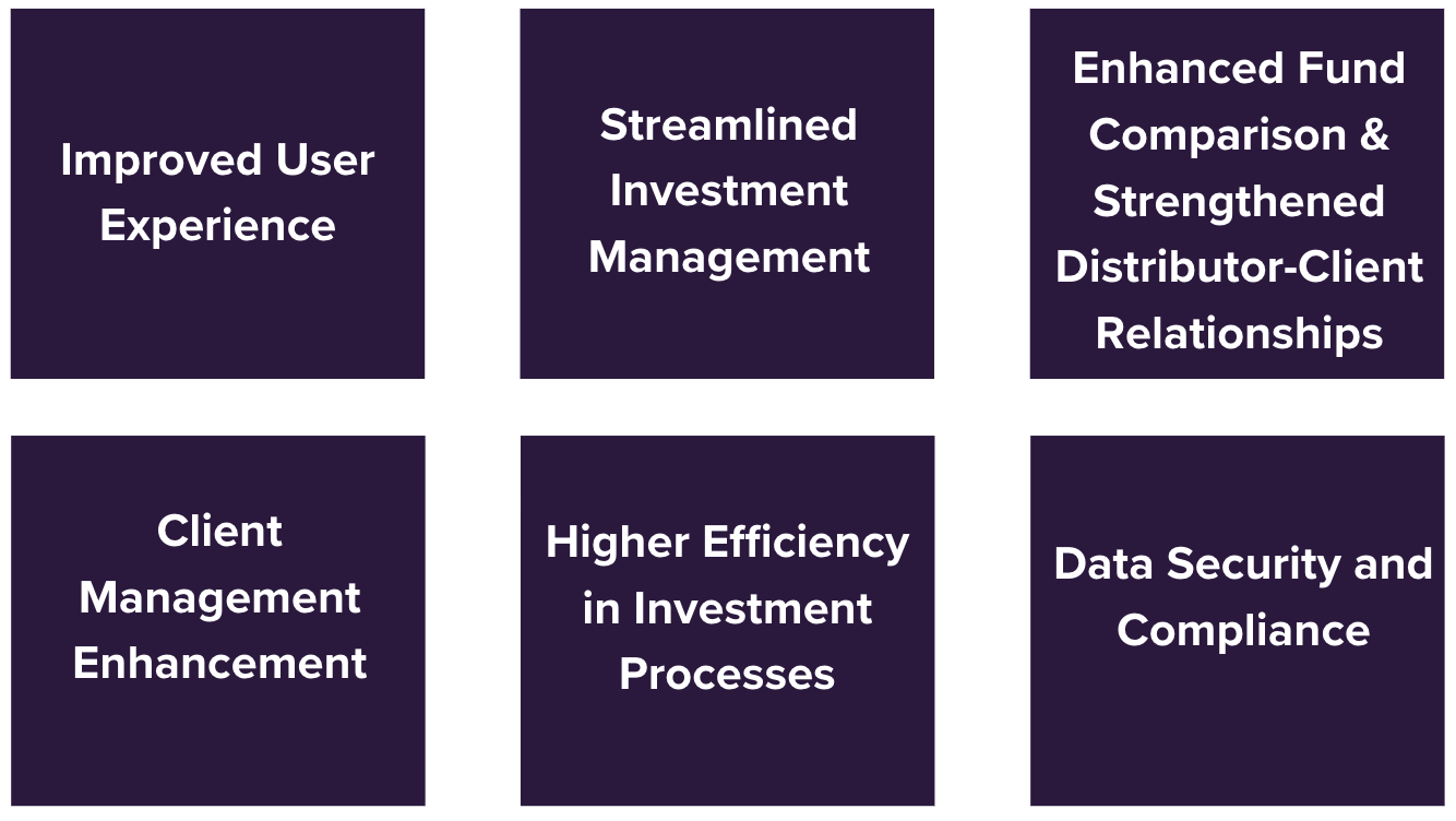
Proposed Solution
To streamline the core data within Edge 360 Money, such as KYC, Investments, Portfolio, and Payment Page, it is advisable to eliminate extraneous information like Detailed Portfolio, Comprehensive Transactional Details, Customer Support, FAQ, and the like. This will result in a more lightweight Edge 360 App, prioritizing essential information.Design Process
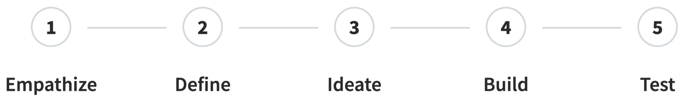
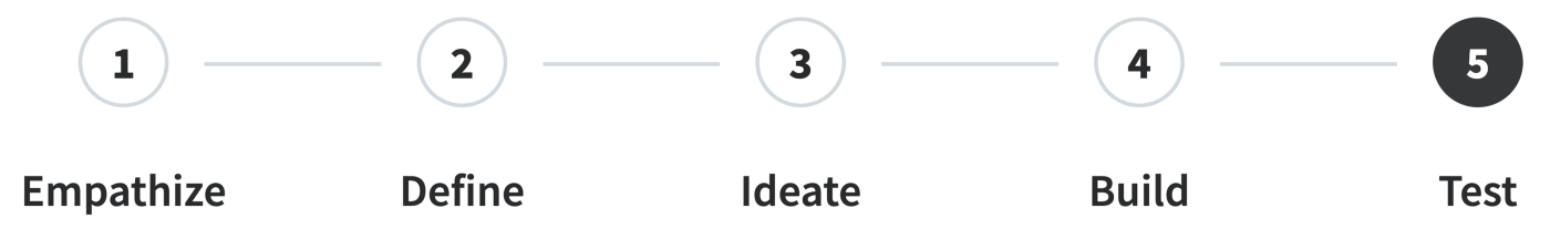
- Empathize — Survey, Focus Group and User Interview.
- Define — User Persona; Benchmark .
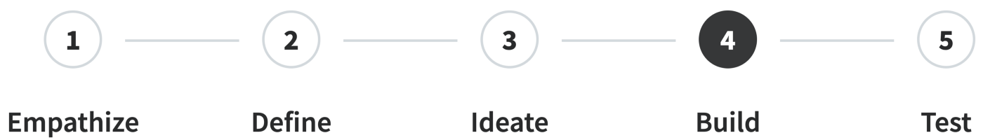
- Ideate — How Might We…?, Sketch, Style Guide and Task Flow.
- Build — Wireframe, UI Screens and Prototype.
- Test — Implementation, Usability Testing, Improvements, Outcome and Lessons.
01 / Empathize - Exploring the User's Needs
Research
We spoke to the target audience; our age group was of 22 to 55 years. Conducted a survey asking about their investments, what app they use. Problems that they face and what improvements they need in investment apps.Stakeholder Interviews
Interviewing the stakeholders has helped me identify the right audience for the Edge 360 product and the characteristics of the study participants. Just as with this product, the best offerings come from carefully identifying the target audience, their needs, and their wants. It has also helped me understand the full concept behind the Edge 360 Lightweight App.
Interviewing the stakeholders has helped me identify the right audience for the Edge 360 product and the characteristics of the study participants. Just as with this product, the best offerings come from carefully identifying the target audience, their needs, and their wants. It has also helped me understand the full concept behind the Edge 360 Lightweight App.
Competitor Analysis
A competitive analysis is a method used to collect and compare data about products in the market space. This approach is employed to highlight the strengths and weaknesses of products, enabling more informed decisions about your product strategy.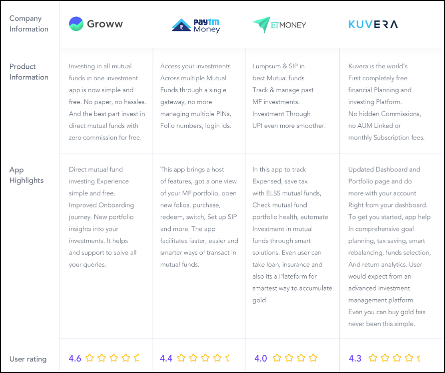
We delimited the segmentation related to types of funds from the study and research of investment perspectives.
Surveys and User Interview
On alternate days, we administered two types of questionnaires to both distributors and investors. The surveys consisted of 20 qualitative questions concerning habits, customs, communication preferences, and users' visual preferences.These surveys were completed by two groups, comprising a total of 56 participants. The results of the qualitative research aided us in understanding the intentions of distributors and investors when dealing with mutual fund applications.
During our research, we observed that some investors were averse to performing simple tasks, such as making purchases or creating folios, which are related to a group of investments in a single fund. This suggests that individual actions and attitudes may still be unclear to distributors, who tend to prioritize major actions within the app. While many distributors and investors regarded fundamental issues like the initial KYC as important, others lacked reasoning and common sense, particularly regarding questions related to purchases and redemptions. These questions are vital for encouraging ecologically conscious citizens to contemplate collective actions.
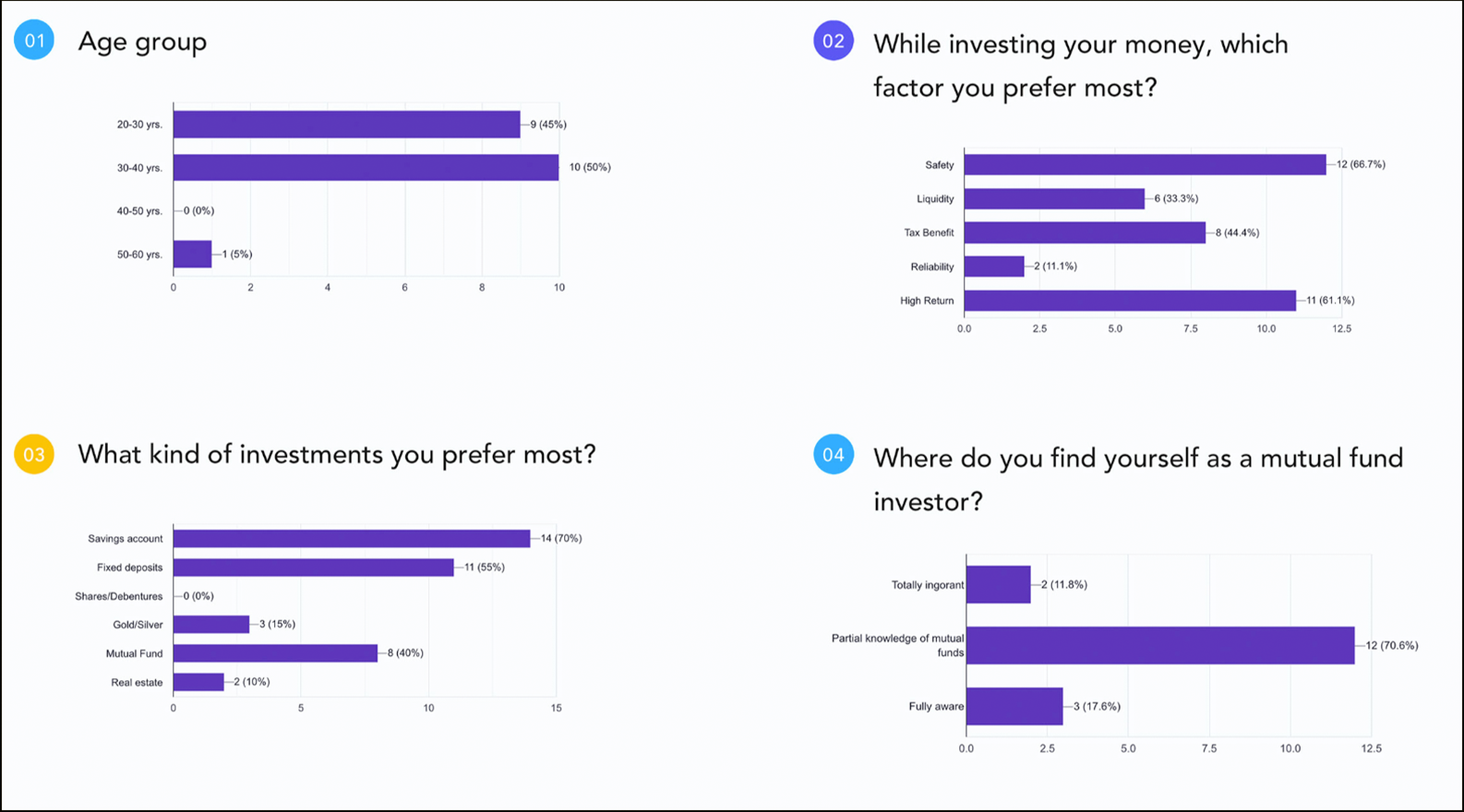
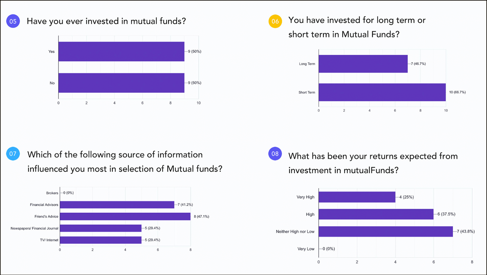
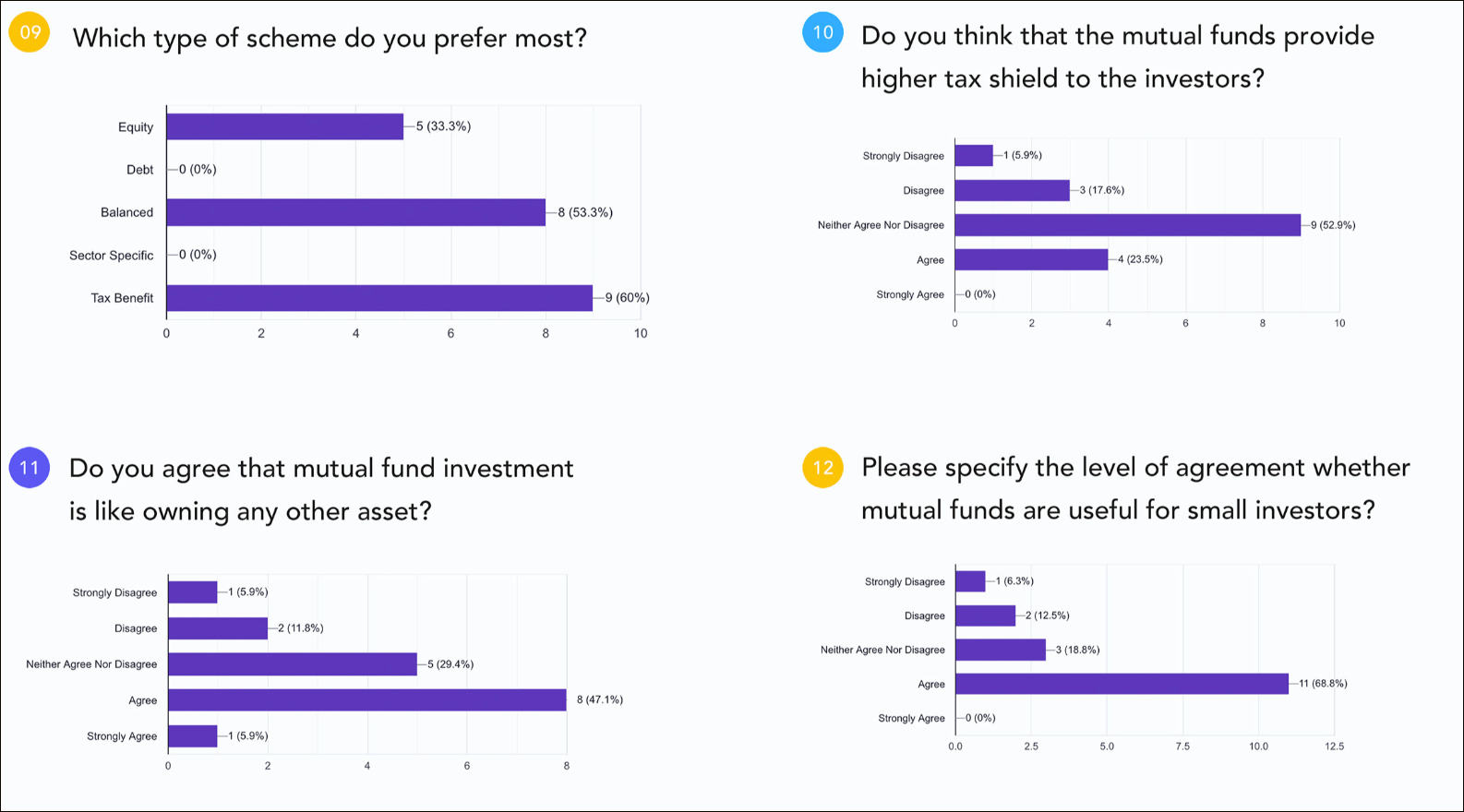
- Is Edge 360 safe for a mutual fund investment? My money will directly invest with AMCs (Asset Management Company) or not.
- How effective is investing in Edge 360 SIP (Systematic Investment Plans) mutual funds?
- Is Edge 360 just a platform which provides me an option to invest in mutual funds, as an investor. I am not aware of which funds suit me best and I can manage my investments on Edge 360 or not.
- User want to get statements, such as Portfolio Holdings, Transaction Summary, Realised Gains & Tax Saving Statement.
- The user needs more details on the goals section like how much time we achieved our investment goal. It will motivate us more if we will get to see the showtime.
- We want to know the risk of all schemes before we take out the decision to invest.
- Is there any hidden fees or commissions on Edge 360, how many maximum returns on our money. And how much percentage will Edge 360 take?.
The most significant complaint from the interviewees was the requirement to perform daily tasks for distributors and investors to make them accessible, such as Quicklinks. In addition to purchasing and redeeming, there is a need for emphasizing more immediate actions on the dashboard. According to the interviewees, detailed reports for each transaction should be easily shareable with others.From the results of the data collection, it was possible to define the actions of the characters. Various possibilities for selecting experiences were identified and grouped based on correlations. The distributor's references, routines, and desires were consolidated into four major interest groups.
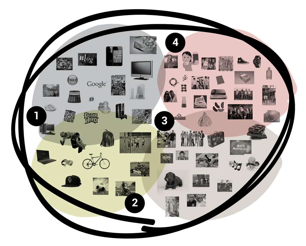
The groups of interested distributors, working professionals, self-employed, and business people were defined from the collected data. It served as a starting point to create the content and the characters of the user personas.
Data Validation
We realized the need to verify the data obtained for the validation of the research and, consequently, to apply the results in the development of mutual funds.The references, routines, and desires mentioned in the research were grouped so that the distributors and investors could discuss them in a focus group and provide feedback about their choices. This exercise allowed for the creation of affinity associations and the subsequent development of user personas.
02 / Define - Establishing the User's Needs and Problems
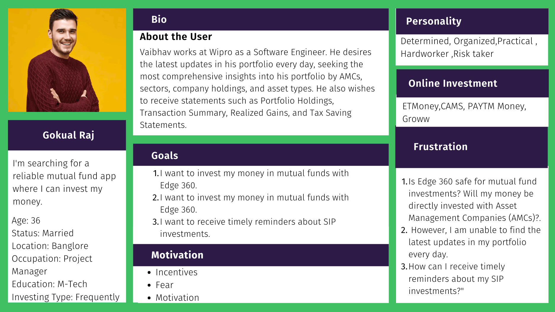
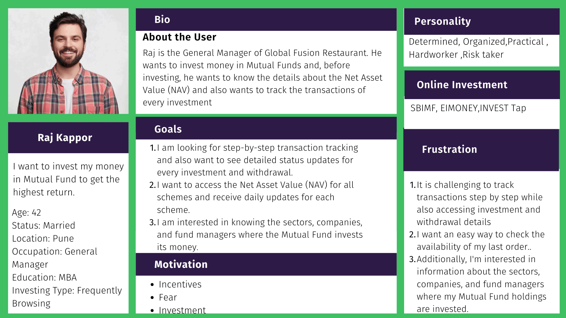
User Personas
I synthesized my personas from observations, research, and stakeholder interviews. To create a thorough user profile (persona), I typically include social and demographic characteristics, needs, desires, goals, habits, expertise, cultural background, and motivations.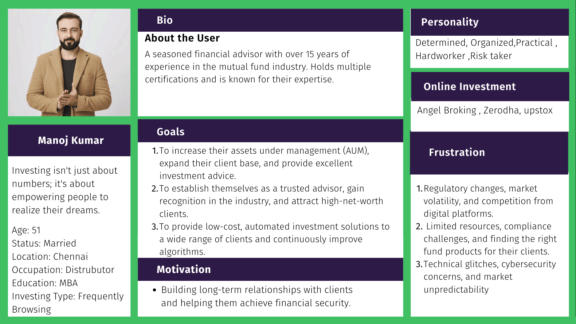
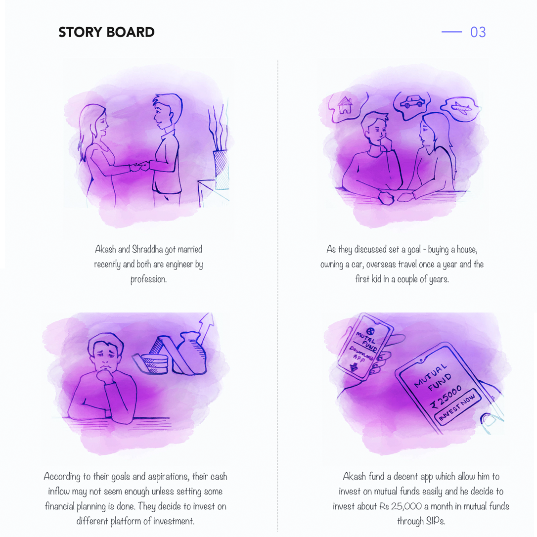
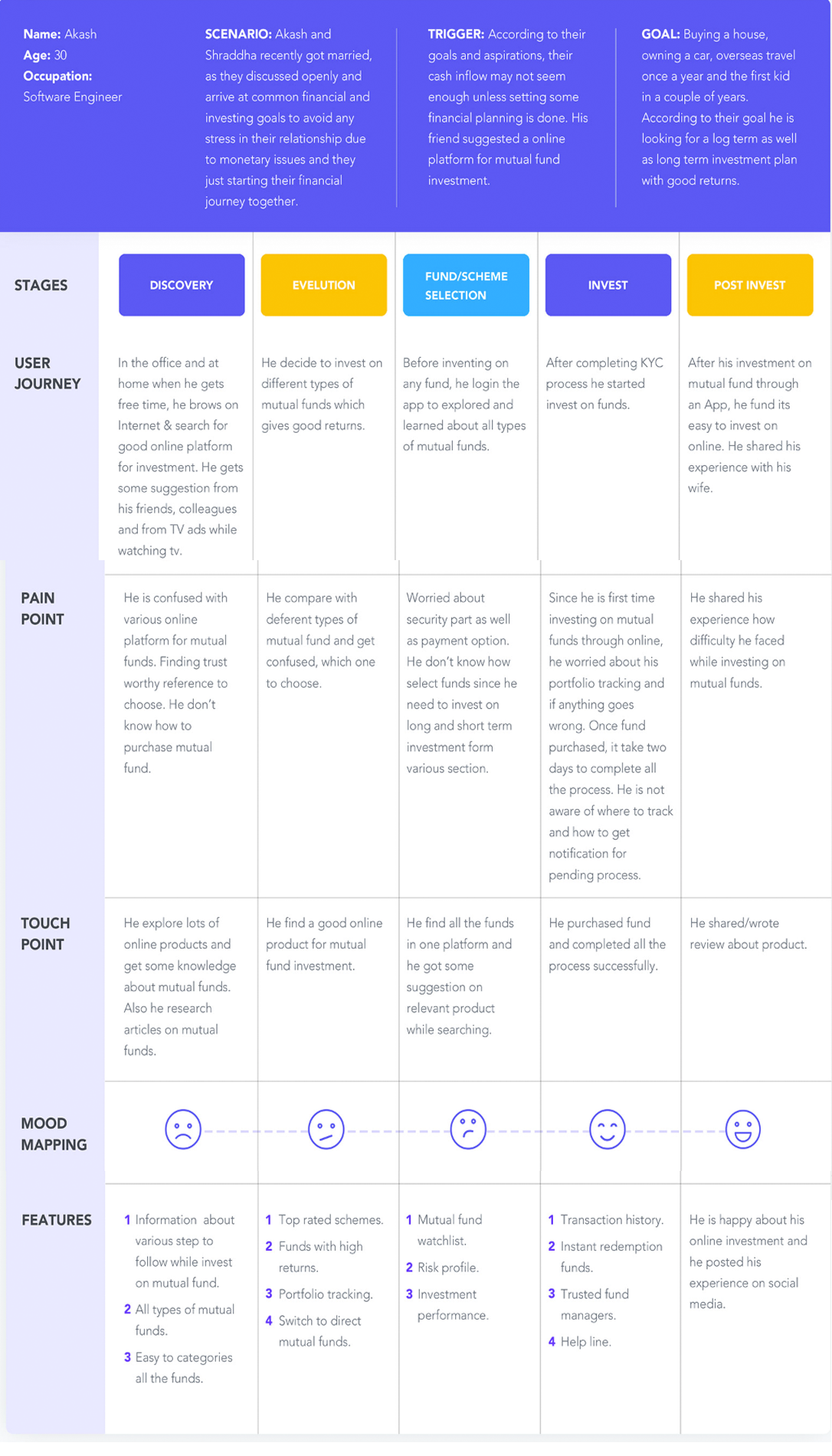
Storyboard
Customer Journey
Problem Statemenets - How Might We…?
To encourage brainstorming and a change of perspective about the project, we attempt to rephrase the problem statement by starting with the question, "How might we.User/Point-of-view statement:
Through my research in this project, I have gained valuable insights that enable me to create a Point-of-View based on a deeper understanding of our users, their needs, and the most critical insights about them. How might we assist distributors and investors in comprehending the impact of their choices to achieve success in mutual fund investments? We provided a broad scope to stimulate thinking about solutions that transcend the status quo. The team engaged in a brainstorming session to address the proposed question, and we recorded each member's ideas on post-it notes so that everyone could vote for the most viable approach.
After the brainstorming session, some ideas emerged:
- Is Edge 360 Money a safe option for a mutual fund investment? Will my money be directly invested with Asset Management Companies (AMCs)?
- How effective is investing in Edge 360 SIP (Systematic Investment Plans) mutual funds?
- Is Edge 360 Money simply a platform that allows me to invest in mutual funds? As an investor, I am not certain which funds are best suited for me, and I am wondering if I can manage my investments on Edge 360 Money.
- I would like to receive statements such as Portfolio Holdings, Transaction Summary, Realized Gains, and Tax Saving Statements.
- User want to get statements, such as Portfolio Holdings, Transaction Summary, Realised Gains & Tax Saving Statement
- The user wants to understand the risks of all schemes before we make the decision to invest.
- Are there any hidden fees or commissions on Edge 360 Money? What are the maximum returns we can expect on our investment, and what percentage will Edge 360 Money charge?
03 / Ideate - Creating the Framework
User flow
In order to scope out the experience, I began creating the user flow to visualize possible solutions for each scenario. Mapping out the experience helped me figure out where each feature should reside within the app's architecture and helped me create the right product story. (The current app flow might be slightly different from what we initially designed, considering user needs and business requirements.)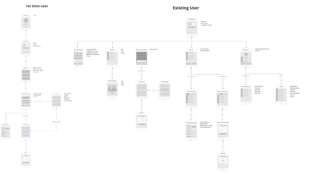
Sketch
I needed to develop a screen representing the Voice speech with the buttons to choose between options. Also, I had to establish a hierarchy because it was essential to show the result index at all times (as it was a signal to the user whether he was on the right or lousy path). The seventh draft version met all the prerequisites for the mutual fund flows, and for that reason, I considered it before starting the screen design step.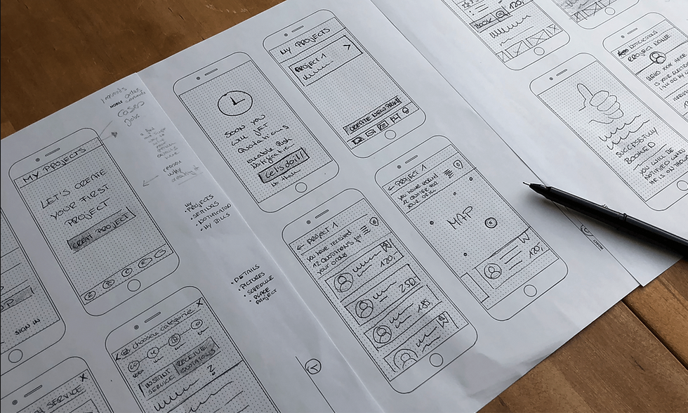
Wireframe
It was necessary to develop a hierarchy of the layout' positioning in the screens to establish the equal importance of the elements above and balance the arrangement of the features on the screen.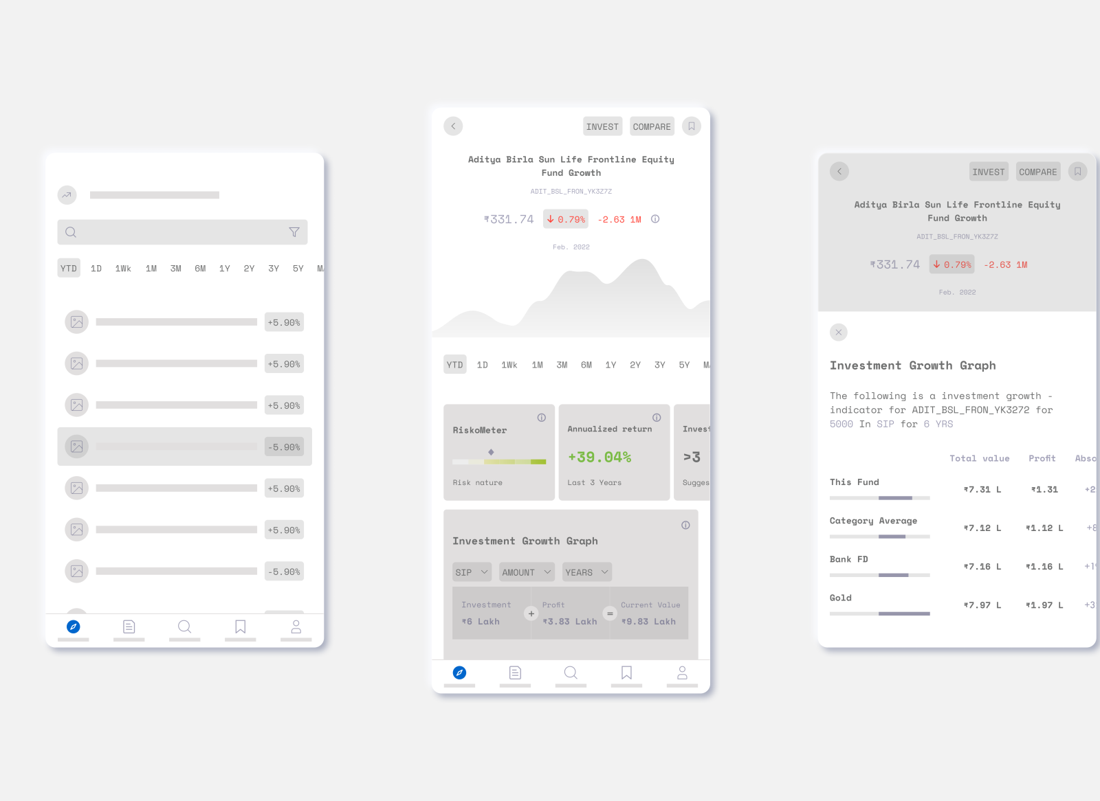
Based on the research references and analysis of the two proposals, I decided to discard Wireframe 1 and Wireframe 2 as they did not meet the basic requirements. Therefore, Wireframe 2's suggestion proved to be a suitable hypothesis, establishing the ideal starting point for the development of the mutual fund industry. With touch-enabled devices, users are in close proximity to the screen and often use both thumbs for interaction, making it essential to create user-friendly touch areas at the bottom of the screen.
I also considered these touch areas, as they significantly impact the performance and usability of user data. Based on the collected information, I adapted the selected wireframe and defined other screens from the initial drafts. I set the resolution to 1024 × 768 pixels and utilized the main layout grid to optimize content for a satisfactory viewing experience.
User Interface Color Palette:
The choice of the color palette for the project was derived from the research field, where we analyzed five apps and websites with content related to mutual fund goals, pie charts, and more. For each benchmark (such as Purchase of Mutual Fund, SIP, Redemption), we identified the most predominant color tones by extracting colors using a color picker tool. Additionally, I obtained the corresponding hexadecimal codes for web projects, ensuring compatibility with current monitors, which support a wide range of color combinations.
Typography
karvy, in the application Typography for mutual fund geography: legibility research, synthesized and compiled the conclusions of several researchers with different methodologies in the field of psychology and design, which guided the choice of typography for this project. The main points identified by the target audience were:Preference for “sans serif” designs and slight inclination;
The reduction of the body and spacing influences the fluency of reading; The use of different typographies does not significantly affect learning; The preferential use of typographies whose difference in the characters o, a and g is very evident; More informal typography can motivate reading, but children find it easier to read texts that appear more “normal.” Aller typography is straightforward, well designed and easy to read. On the other hand, it is designed for printed media, with small creases in some of its letters. On the other hand, Calibri has harmonious proportions and rounded endings, which District Pro Medium does not have. Due to the technical aspects addressed, as it has greater consistency for web projects. Because it is better suited to the target audience's visual needs, the montserrat typography was defined here as the most ideal for developing text blocks. Therefore the typography was chosen for the context of this project.
The “sans serif” text is the fastest to read, the exact opposite when it comes to the printed version. — JAKOB NIELSEN, Prioritizing Web Usability.
04 / Prototype - Let's make the Design!
Visual Screens
The login screen of the Edge 360 app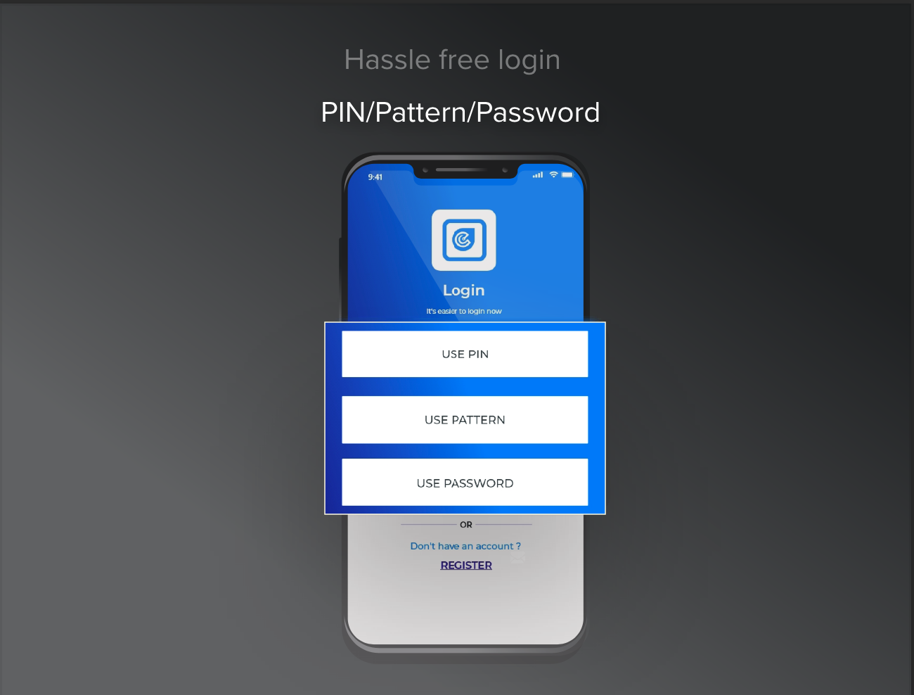
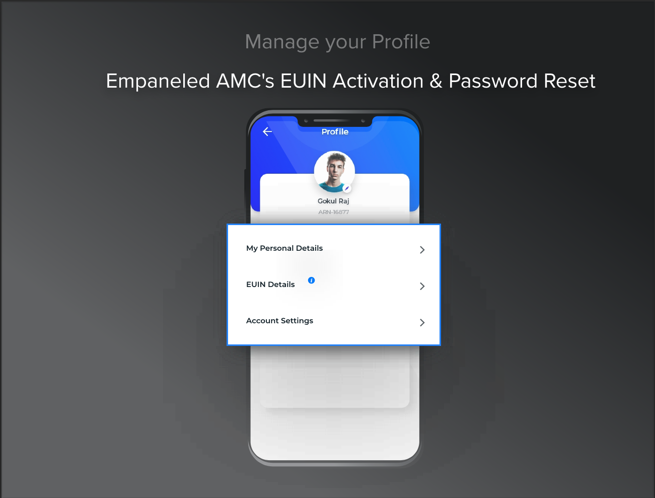
The profile of the Edge 360 app
The Dashboard of the Edge 360 appp
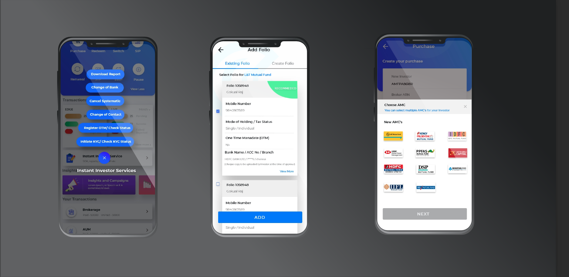
Instant Services, Add Folio, Choose AMC
High-Fidelity Detailed Design
Having a background in design I love getting my hands dirty and producing the final high-quality visual designs as well as the guidelines and specifications. I’m always up-to-date with the latest industry trends and I also have a passion for design innovation.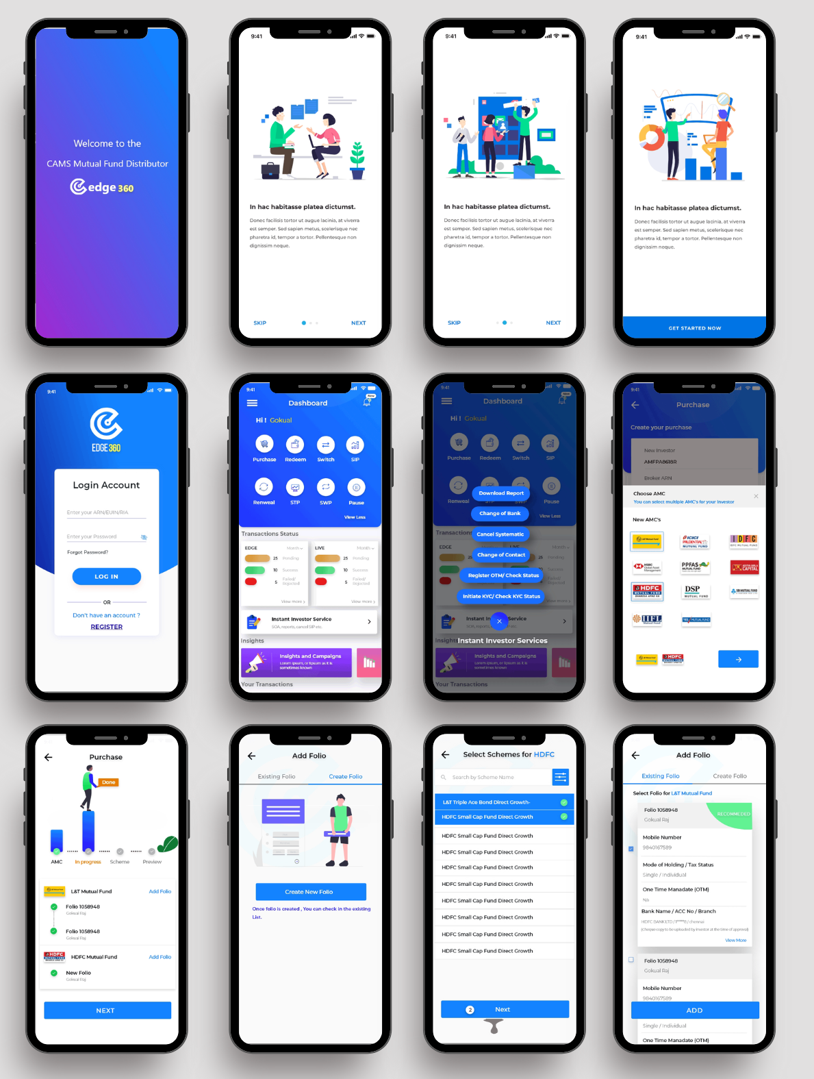
Edge 360 Application Marketing Video
Implementation
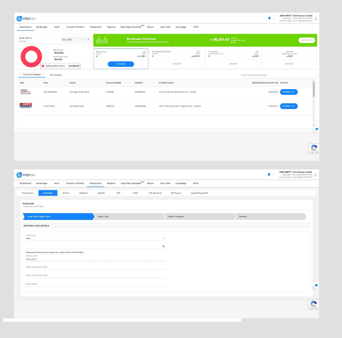
Now, become a smart financial distributor with Cams’s Edge 360. Access the universe of KFintech serviced mutual funds on your smart phone. No more running around with documents or getting stuck with lengthy processes while initiating mutual fund transactions for your customers. As a distributor and a financial distributor, Edge 360 enables you to instantly fill customer details, bunch all the documents and invest with the ease and speed of a touch. This means, you can now initiate transactions, generate reports and seek statements on behalf of your customer right from where you are. Get more productive and effective in delivering quick and delightful services to your customers. Edge 360’s full service menu, intelligent features and intuitive navigation empowers you to achieve faster and earn more. You can also track each customer’s portfolio and send reminders on new fund offers, SIP, repurchase and redemption. And of course, all your earnings are pooled so you can instantly touch and view.Key Features
Initiate TransactionsQuick start
- Use customer PAN to auto fill customer details
- instantly bunch all documents and invest on behalf of customer
Touch and transact
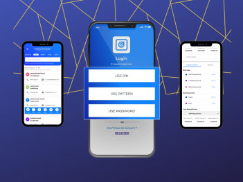
- One-time Pin/Pattern login
- instantly bunch all documents and invest on behalf of customer
Smart and productive
- Industry first Phygital mode transactions
- Simplified Client search (Name, Mobile, Email, PAN, Folio)
- eKYC
- SIP summary (Expired, Terminated, with & without SIP client list)
- AUM Summary
- Brokerage Details
- Mail back (self) and Investor
- NAV
- Investor Portfolio
- Transaction History
- SIP Cancellation
- SIP Pause
- Customer-wise AUM Report
- Investor Master Information
- Transaction wise investor Master
- View last five transactions
05 / Test - It's time to test the Prototype!
Usability Test
For the usability test, we selected 12 Distributors and investor of different gender, ages and interests in groups of personas.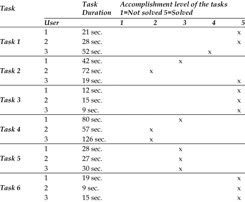
The selected users passed the test following specific tasks:
Tested functions:
- Understanding of the item “Instruction”;
- Use of the “Help” item;
- Visual recognition of user personas;
- Choose a fund and complete the activity.
The Solution
- I have enhanced the user-friendliness of the Mutual Fund Page, making it more user-friendly and easy to navigate. Aesthetically, it now boasts a more appealing design.
- I've improved the graph section to make it more comprehensible and user-friendly. The Fund Manager section is now clearer for users, and the Investment Return Section has greater prominence. Users can easily check their investments by entering the desired amount
- The share icons now have a larger tapping area for improved usability. Other sections have also been made clear.
- Now the Fund Manager section is more clear for users. Investment Return Section is more prominent than earlier. And the user can check the investment by entering the amount.
- I've made the call-to-action (CTA) more prominent to encourage users to click.
- The reviews section has been relocated below, and each review is now displayed individually.
- CTA I made more prominent to click.
- To build trust, I've placed the Edge 360 Money promises below with corresponding icons.
- For trusting building, I put the Edge 360 Money promises below with icon.
- I've included an FAQ section to provide users with more clarity about Edge 360 Money.
Measure/Impact
Our findings provided Edge 360 with a deeper understanding of how their users perceive their services and products and evaluated the user-friendliness of their application/website. We also measured their NPS score using UX NPS metrics, which helped them gauge their market standing. Through our in-depth report, this leading insurance firm gained insights into their users' expectations of the brand and how users perceive the brand. Our solutions and recommendations will assist the brand in improving and enhancing their website/application, not only meeting but also exceeding user expectations.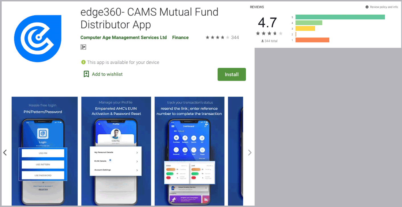
- App & Web Usage– 3 Lakhs+
- Google User Ratings– 4.7+
- Reduced Clicks for buying life Insurance
- Increased – CTR
- Reduction in time required to buy mutual fund
What have I learned?
I discovered that environmental problems are closely linked to human actions, making them the responsibility of individuals. During the UX research and UI development phases, I scoured all forms, references, and visual constructs to enhance the recognition and dynamics of the mutual fund industry. The effort to incorporate various references helped me facilitate distributors' understanding of the proposal. They felt like integral participants in the process, recognizing, experiencing, and analyzing issues that are now much closer to their reality.Stories can always be the same,what differentiates them is how they are told. — EDITH DERDYK