Project Overview
CAMS (Computer Age Management Services) is a leading financial infrastructure and services provider in India, offering a wide range of solutions, including mutual fund services, eKYC, and transaction processing. As part of their commitment to enhancing user experience and streamlining regulatory compliance, CAMS embarked on a project to redesign their eKYC (Electronic Know Your Customer) process.Timeline: ~2 months
Duties: Team's Design Lead, covering interaction design, product strategy, visual design, UX content.
Tools: Photoshop, Adobe XD, Invision , Balsamiq ,Illustrator
Deliverables: Mid-fidelity prototype, wireframes, hi-fidelty comps, presentation deck
Problem Statement
The existing KYC (Know Your Customer) user flow is plagued by a persistently high user drop-off rate, resulting in a significant loss of potential customers and a poor user experience.Project Scope
- No access to users for qualitative user research
- Compliance and Regulatory Requirements
- Branding Customization
Process
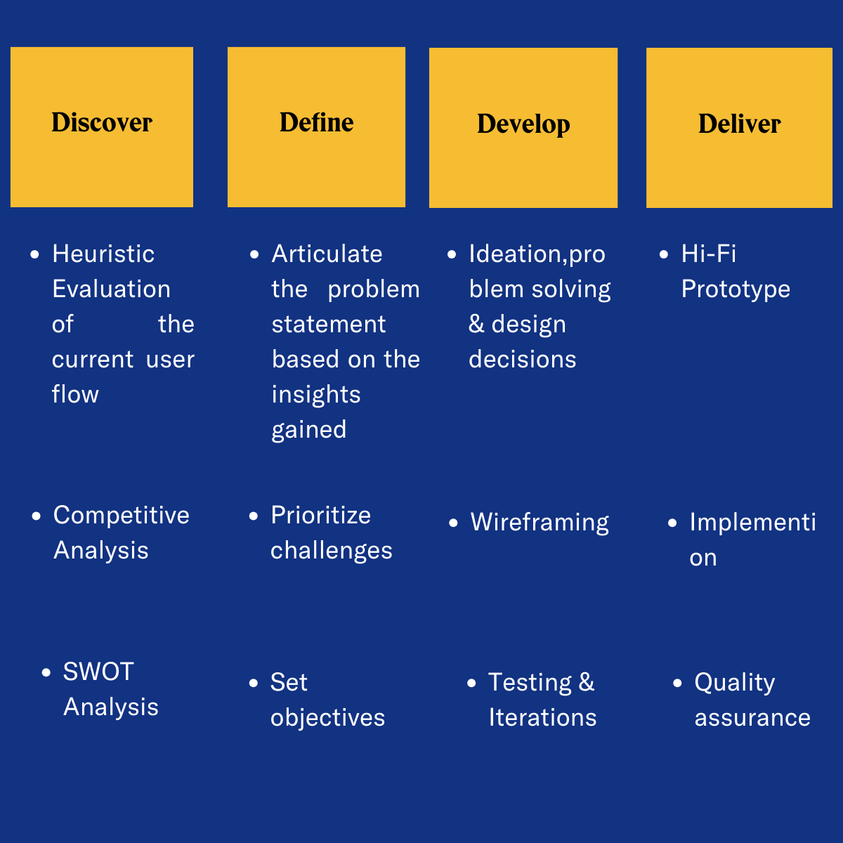
Discover
Before passing judgment on our competitors, let's take a closer look at our own practices and conduct.
A. Heuristic Evaluation on CAMS existing KYC user flow.
It involves assessing the design against a set of recognized principles to identify potential usability issues or areas for improvement and the severity rating was not given because it requires user testing to measure the impact accurately through direct user feedback.
The following are the issues found:
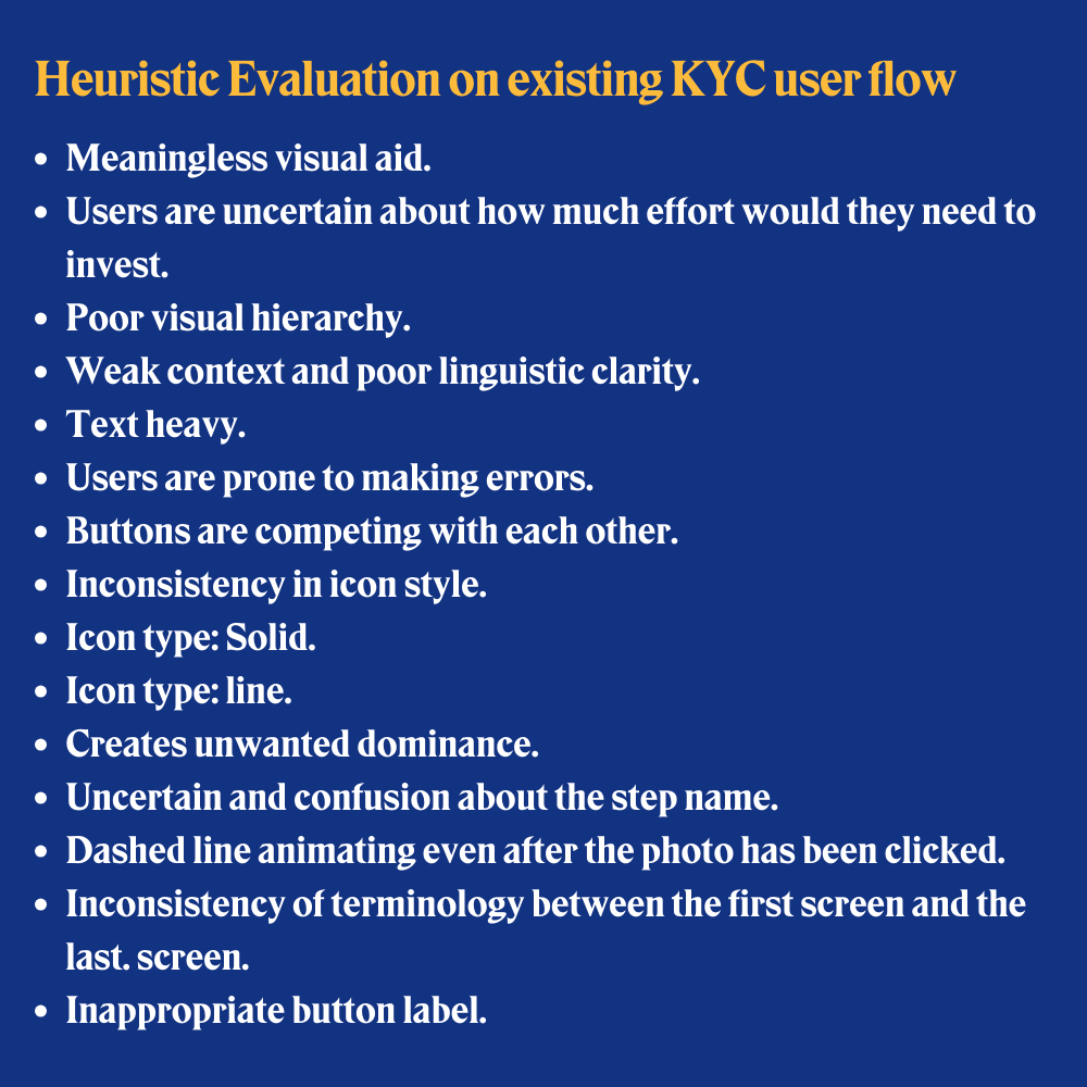
Summarized usability issues
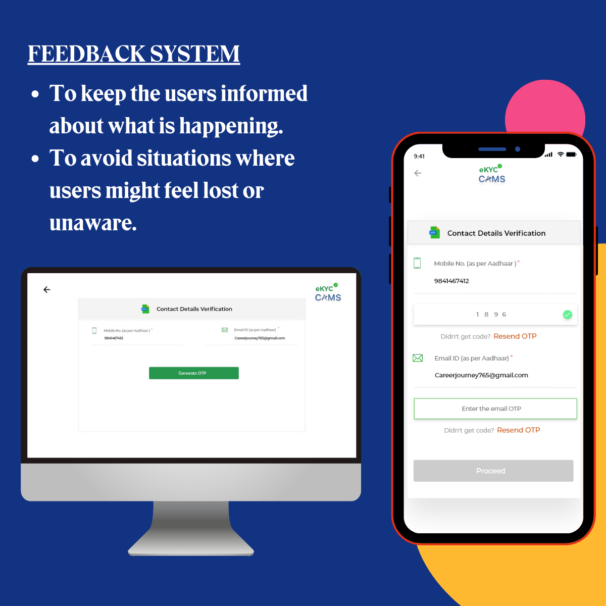
- Lack of Context: Users struggle due to insufficient contextual information during the KYC process.
- Poor Navigation: Navigating through the KYC journey is challenging, resulting in user frustration.
- Lack of Clarity: Users often encounter unclear instructions or requirements, making the process confusing.
- Poor Terminology: The use of confusing or technical jargon hinders user comprehension.
- Meaningless/Lack of Visual Aids: Visual elements are either missing or do not contribute to user understanding.
- Inconsistency in Design Language: The design lacks uniformity, causing confusion and discomfort.
- Error-Prone User Flow: Frequent technical issues and errors interrupt the KYC process.
- Lack of Visual Appeal: The user flow lacks an engaging and visually appealing design.
Now is the time to judge our competitors…
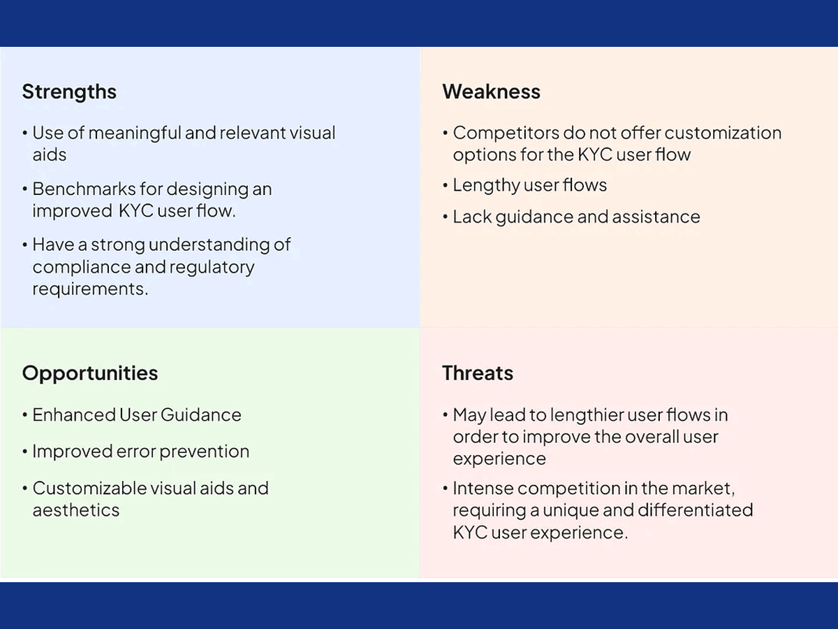
Competitive Analysis
With a list of CAMS direct and indirect competitors in my hand,- I delved into their products for demonstrations and to explore their public-facing features to gain a better understanding of their user experience.
- I analyzed user reviews for valuable insights, familiarized myself with industry standards, and conducted a SWOT analysis.
Define
Here, I distilled the research findings from the Discover phase into a clear problem statement and established design objectives.The problem statement highlights the high user drop-off rate experienced during the KYC user flow. It suggests that users are abandoning the process before completion, indicating a suboptimal user experience or potential pain points that need to be identified and resolved.
Objectives
- Reduce the users’ drop-off rate.
- Create an intuitive user flow which assists users to achieve tasks.
- Enhance the aesthetic appeal of the KYC user flow.
- Allow users to customize the look and feel to align with their branding.
Develop
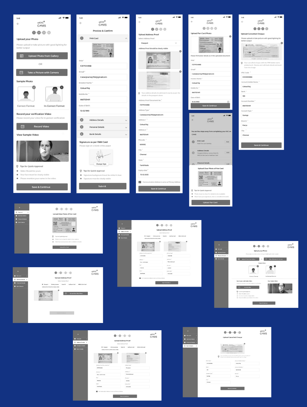
Taking into consideration all the insights and objectives, I began ideating various concepts and design solutions:User Scenarios:
Depending on the type of document a user selects for completing the KYC process, there are different use case scenarios:
- National ID documents, such as Aadhaar (India), Passport, Driver's License, etc.
- Number-based IDs, such as SSN (USA), BVN (Nigeria), etc.
- Aadhaar (Digilocker, for use in India only).
Potential design solutions:
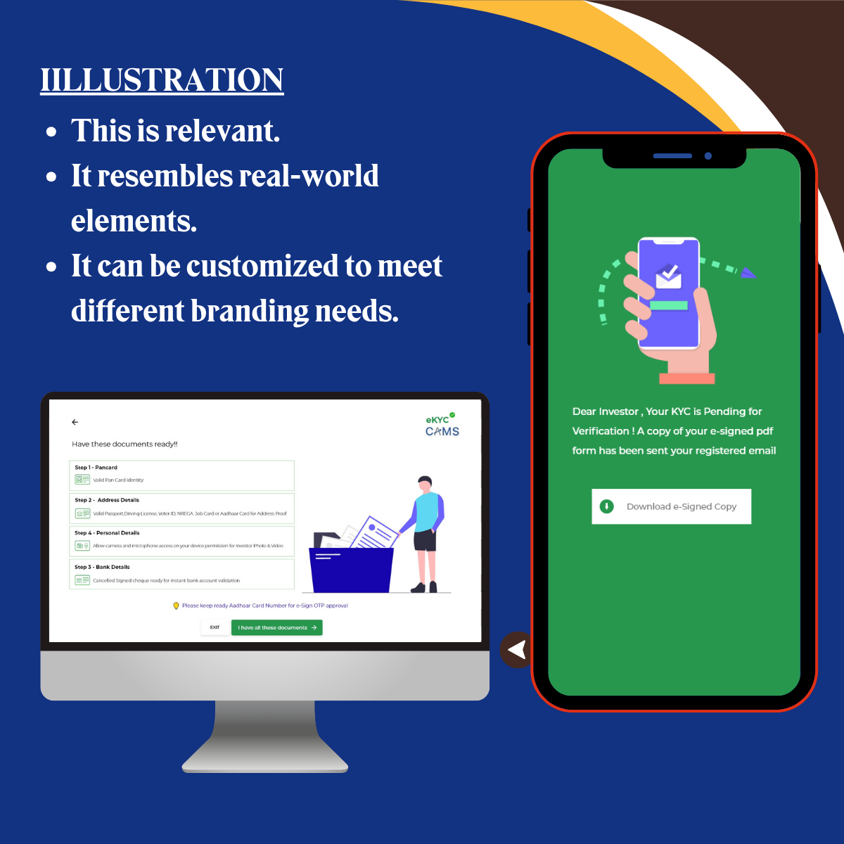
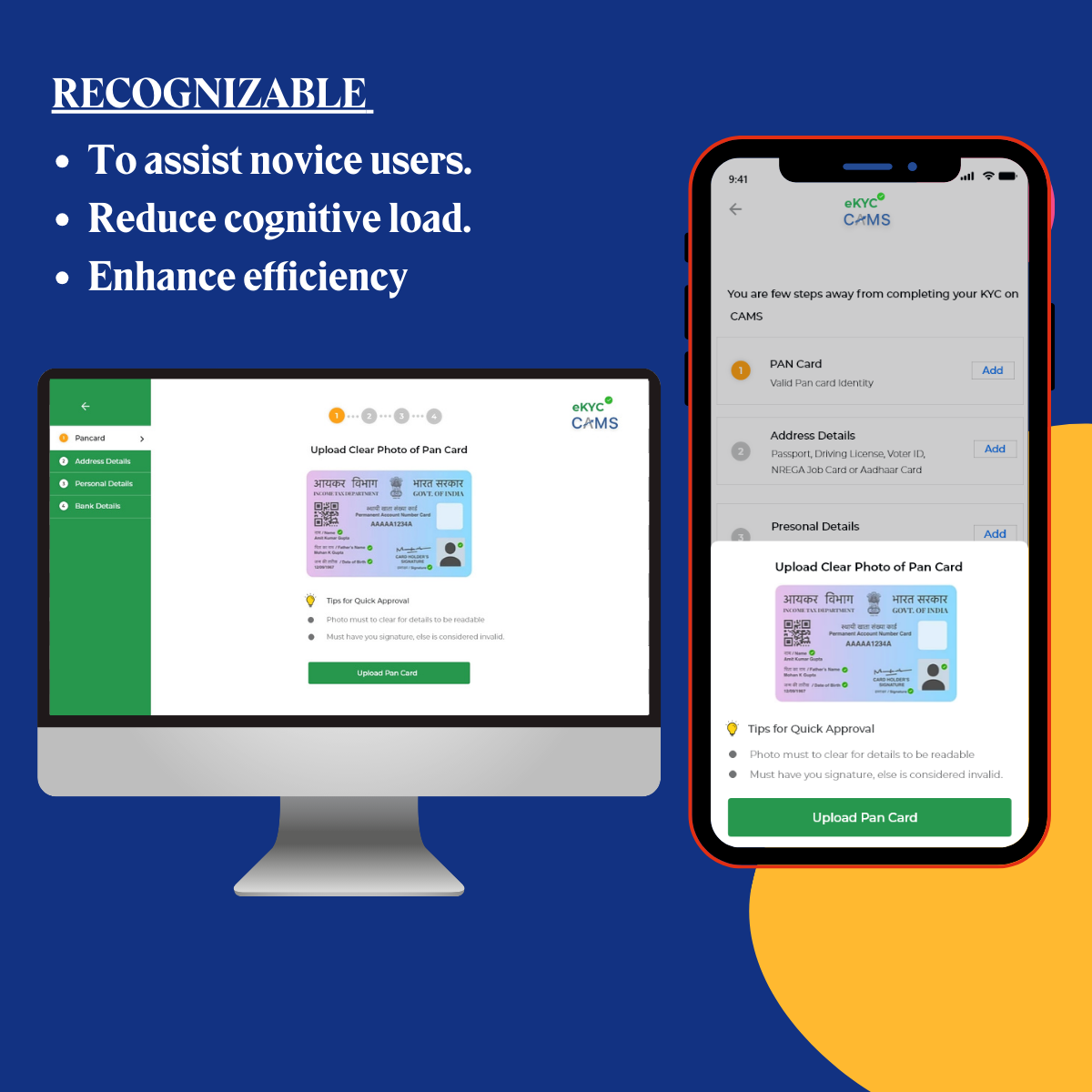
- Relevant Visual aids
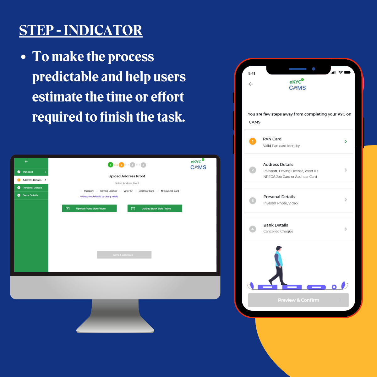
- Deploying a progress bar
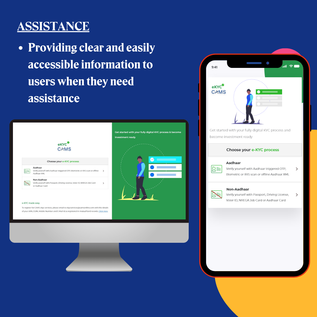
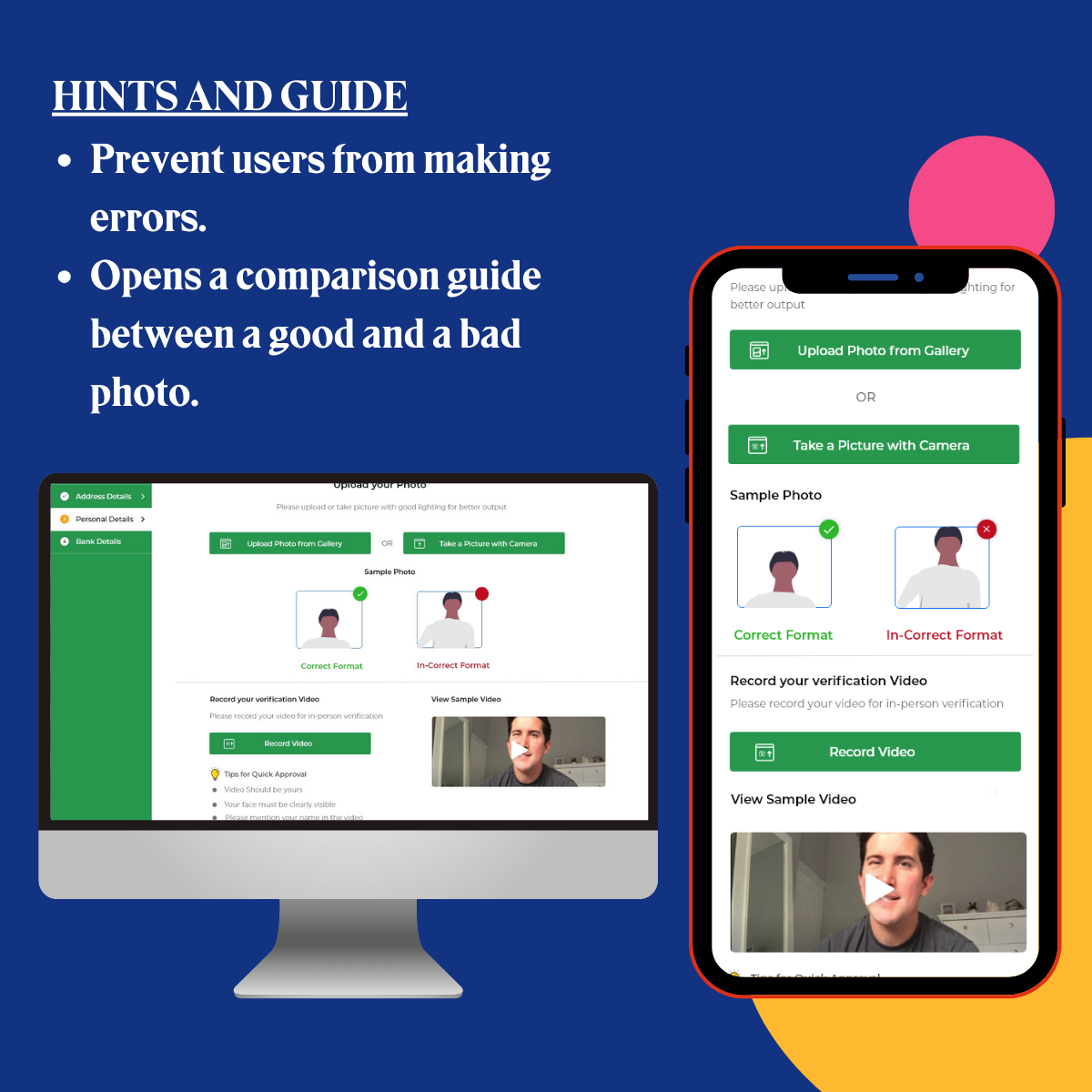
- Assistance to prevent errors.
- Guidance on picture quality while clicking pictures of the documents.
- Step-indicator before starting a task
- Consistency in terminology and design language
- Make it visually appealing to stand out.
Keeping all the major considerations and solutions in my mind, I started wireframing:
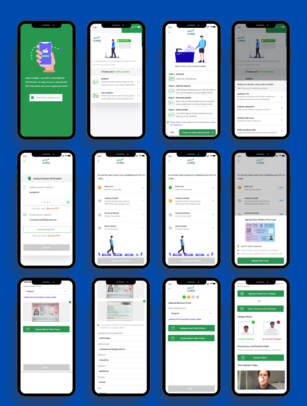
- A. User flow for National ID document:
- B. Testing with the team Although I worked closely with the team, when I presented the user flows, I received valuable feedback.
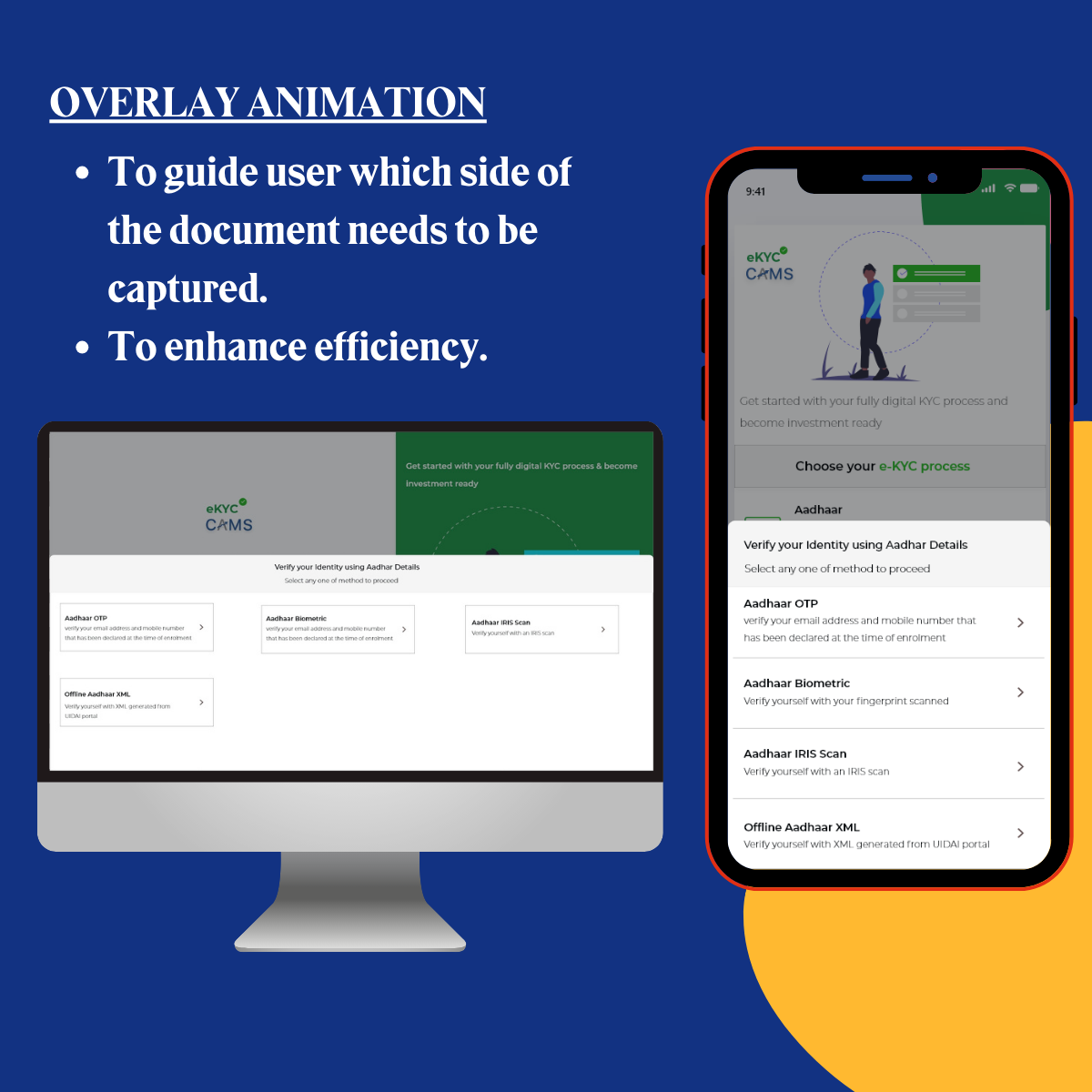
- Even with a step-indicator screen in place, users might still find it confusing whether they are supposed to click the front or back photo of the ID document.
- The 'Things to make sure' on the selfie screen may appear too prominent and could be made more subtle.
- Consider removing the step indicator screen, as it adds to the total number of steps involved.
- C. Iterations The change incorporated was: An overlay animation of the document icon conveys which side of the document is supposed to be captured.
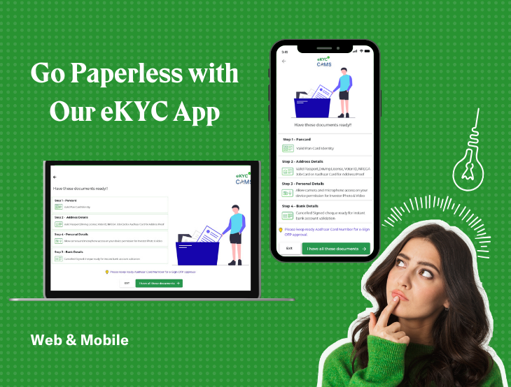
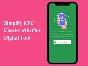
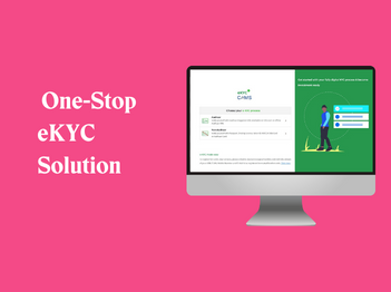
Deliver
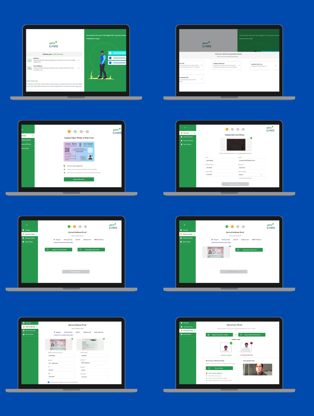
All set to convert that lo-fi prototype into a hi-fi prototype.Let me walk you through final screens and my rationale behind the adopted design decision
Key takeaways
- Designing within constraints can drive innovation.
- User research for B2B products can be challenging, necessitating alternative approaches.
- Continuous improvement is crucial, even when competitors have intuitive user flows.
- Effective communication is key to understanding your work.
Measure/Impact
Coming up with a solution isn't enough. We had to show its success with data/matrics. Mentioning here, To comply with my non-disclosure agreement, I have omitted and obfuscated confidential data/matrics in this case study. Here are some example metrics we used to measure the success of the redesign- Task completion rate — Percentage of the correctly completed task
- Task completion time — the time it takes for the user to complete a task
- Engagement — How often users are interacting
- Retention — Persuading the user to use again
- Revenue — Is the product making money?